Visual Identity for an up and coming eyewear brand based in Brighton.
SERVICES
Branding, Packaging Design, Typography, Visual Identity, Art Direction
CLIENT
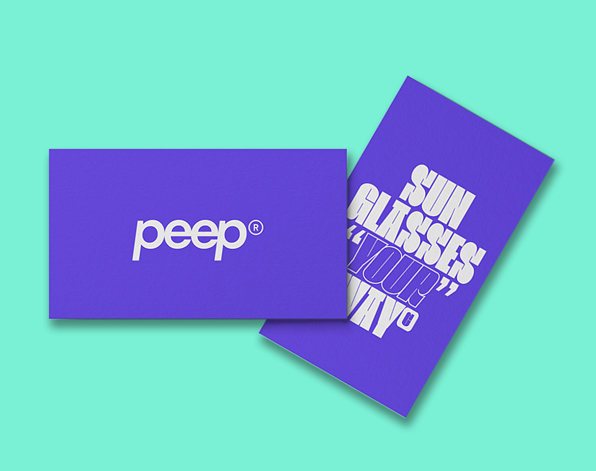
Peep
DATE
Jan 2021 / April 2021
THE BRAND
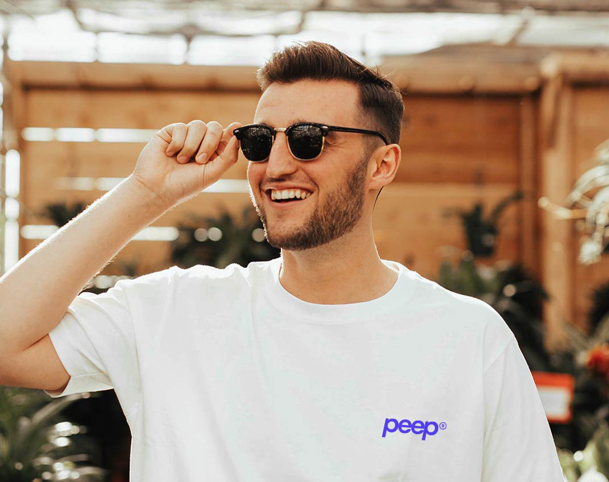
Peep is small yet innovative eyewear brand based in Brighton, UK who prides itself on promoting individuality by offering unique styles and colours to suit everyone. Self expression and customisation is at the very heart of their brand and as such they desired an identity that reflected this.
THE PROBLEM
The client initially desired a logo, business card design and accompanying pattern to be used across all their collateral. However, as the identity progressed and evolved, so did the extent of their deliverables. This expanded to social media advertisements, promotional material and packaging solutions. The client was looking for an adventurous and colourful approach, with the hope of the brand appearing to be playful when compared to larger competitors.
THE SOLUTION
My response to the clients brief was to develop a fun and iconic solution that stands apart from other, more established labels. The core identity is built around a playful retro typeface, of which is inspired by the bold fashion movements of the 90’s. Custom type and colours were further built into the brand to highlight some of their most recognisable styles. This stylistic approach was developed to appeal to the clients core consumers; young adults who aren’t afraid to go against the grain.
Visual Identity for an up and coming eyewear brand based in Brighton.
SERVICES
Branding, Packaging Design, Typography, Visual Identity, Art Direction
CLIENT
Peep
DATE
Jan 2021 / April 2021
THE BRAND
Peep is small yet innovative eyewear brand based in Brighton, UK who prides itself on promoting individuality by offering unique styles and colours to suit everyone. Self expression and customisation is at the very heart of their brand and as such they desired an identity that reflected this.
THE PROBLEM
The client initially desired a logo, business card design and accompanying pattern to be used across all their collateral. However, as the identity progressed and evolved, so did the extent of their deliverables. This expanded to social media advertisements, promotional material and packaging solutions. The client was looking for an adventurous and colourful approach, with the hope of the brand appearing to be playful when compared to larger competitors.
THE SOLUTION
My response to the clients brief was to develop a fun and iconic solution that stands apart from other, more established labels. The core identity is built around a playful retro typeface, of which is inspired by the bold fashion movements of the 90’s. Custom type and colours were further built into the brand to highlight some of their most recognisable styles. This stylistic approach was developed to appeal to the clients core consumers; young adults who aren’t afraid to go against the grain.
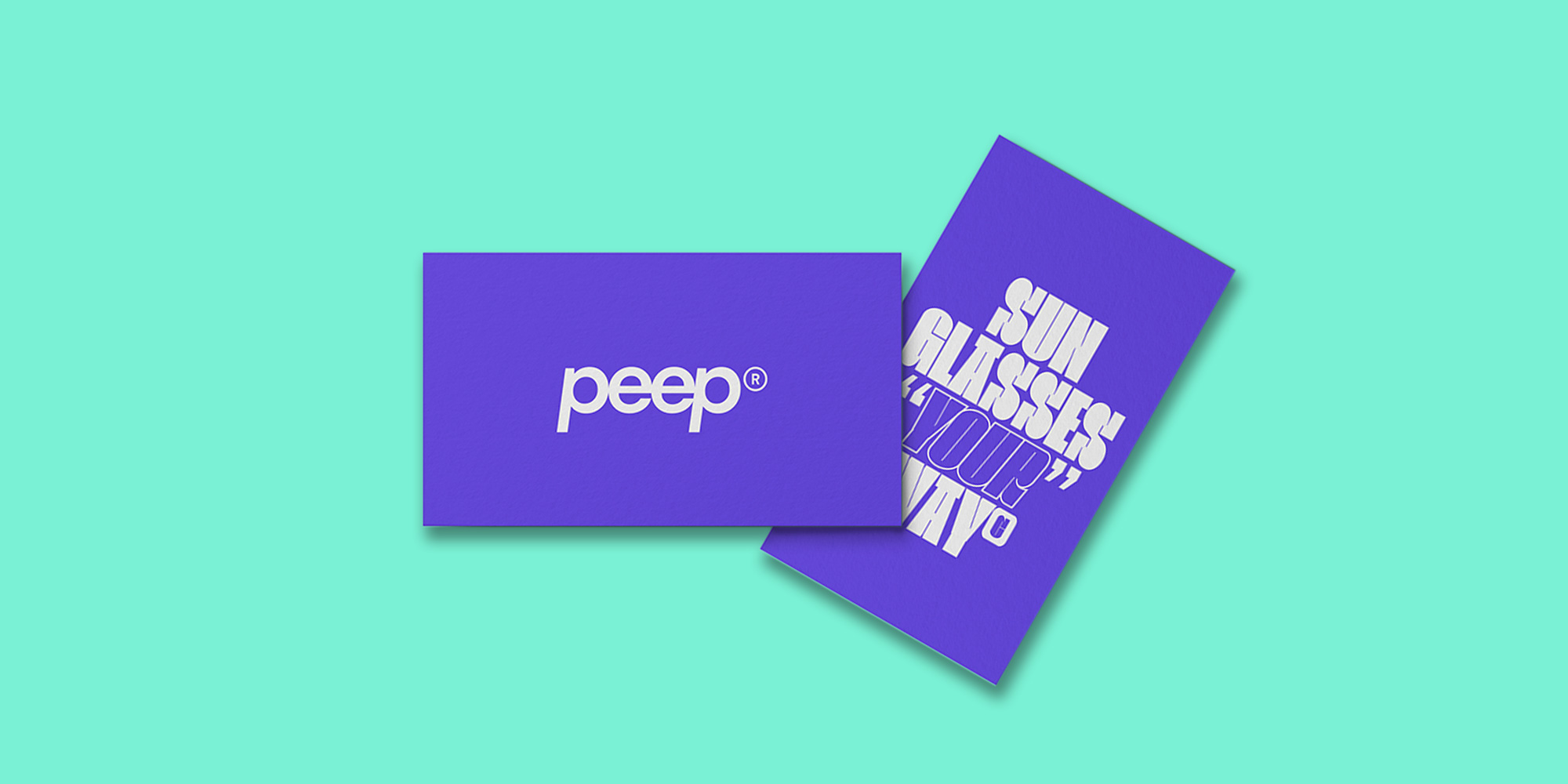
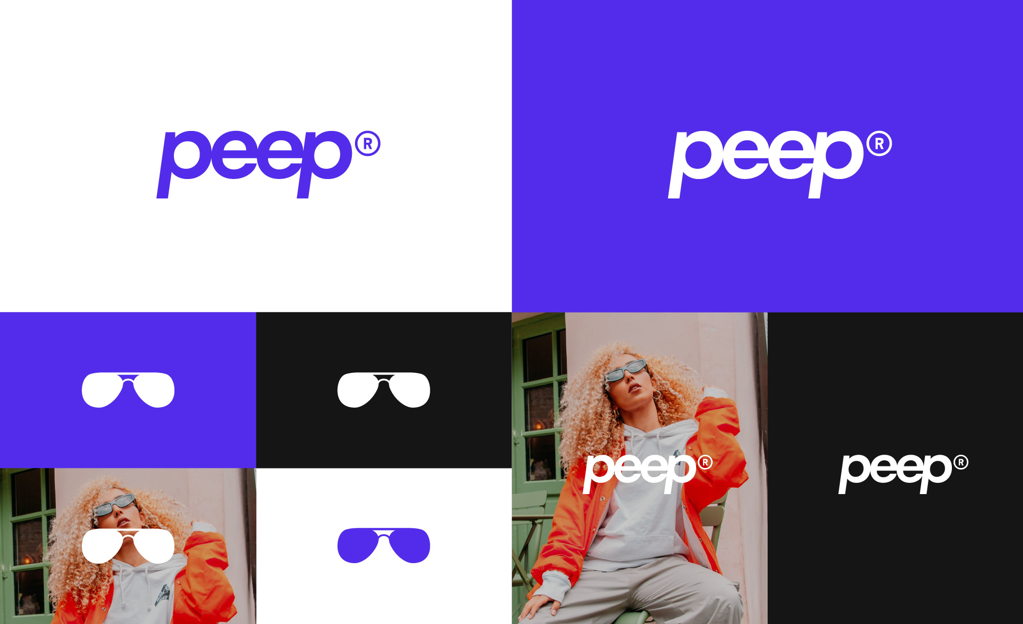
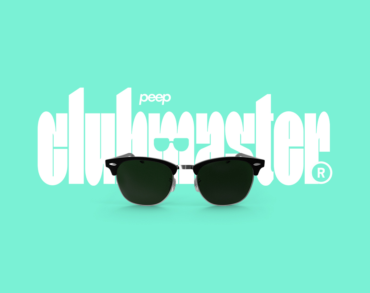
VISUAL IDENTITY
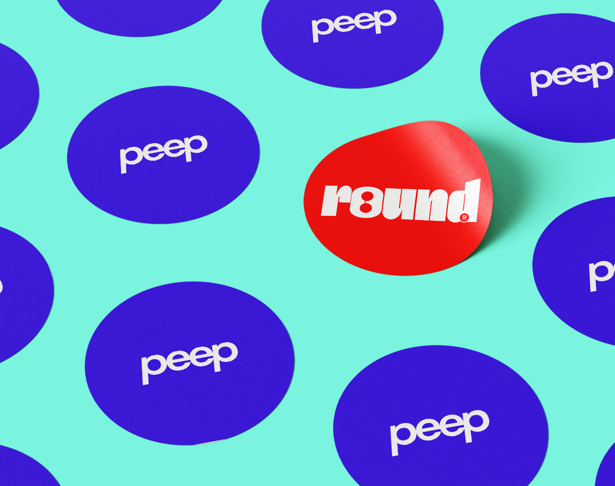
The visual identity does away with what people come to expect from its larger more established competitors. At its core, Peep’s visual language is built around the styles of the 80s and 90s, which have been updated for the modern era. This is evident with the expressive use of colours and the non-confirmative display of type. Peep’s core demographic is more and more becoming infatuated with retro styling, from the clothes they wear to the music they listen to… so why not give the people what they want?
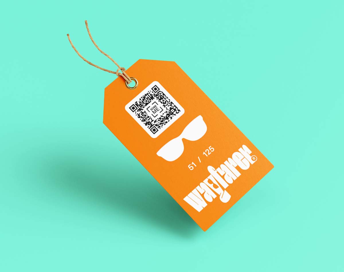
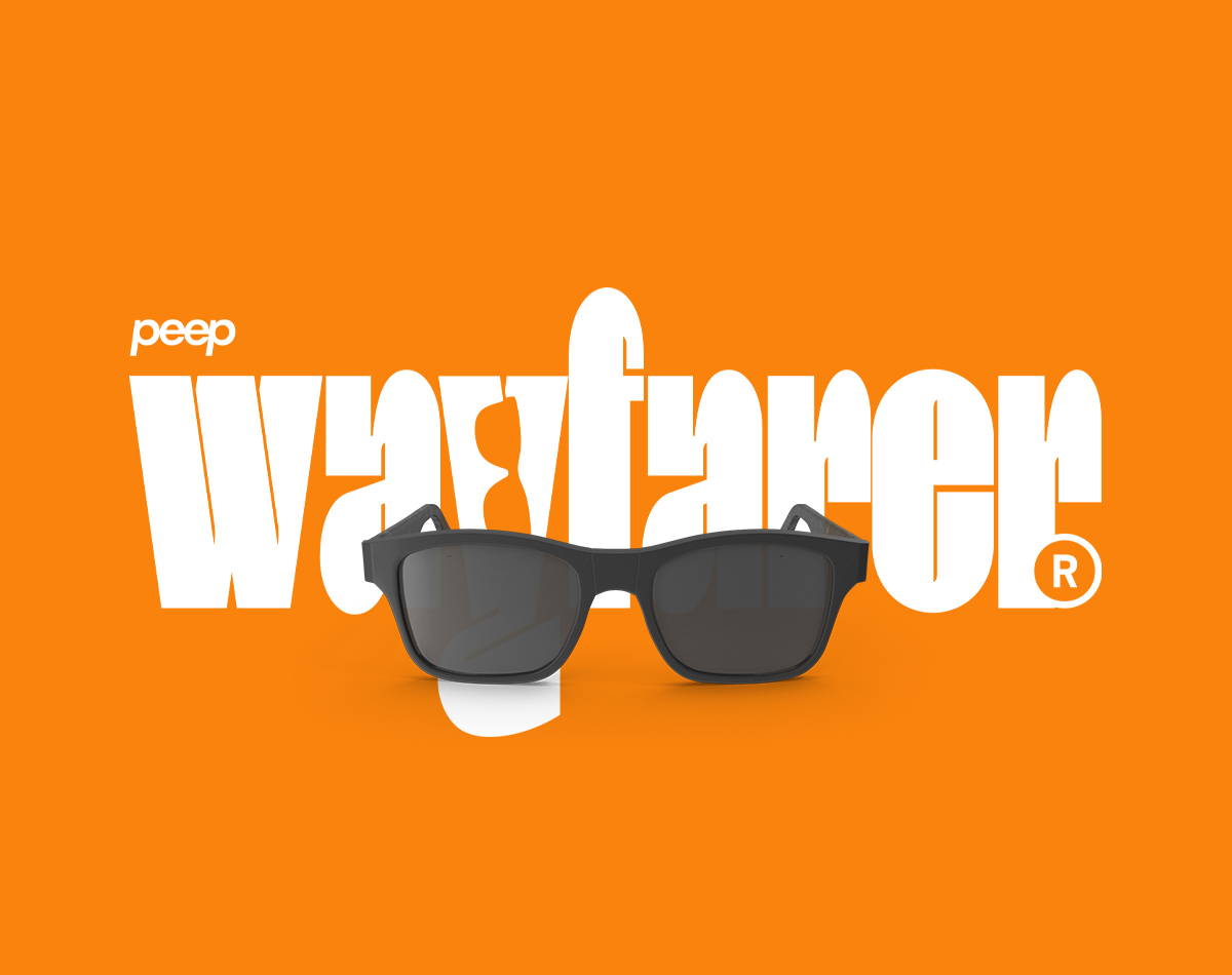
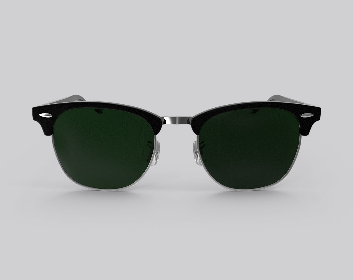
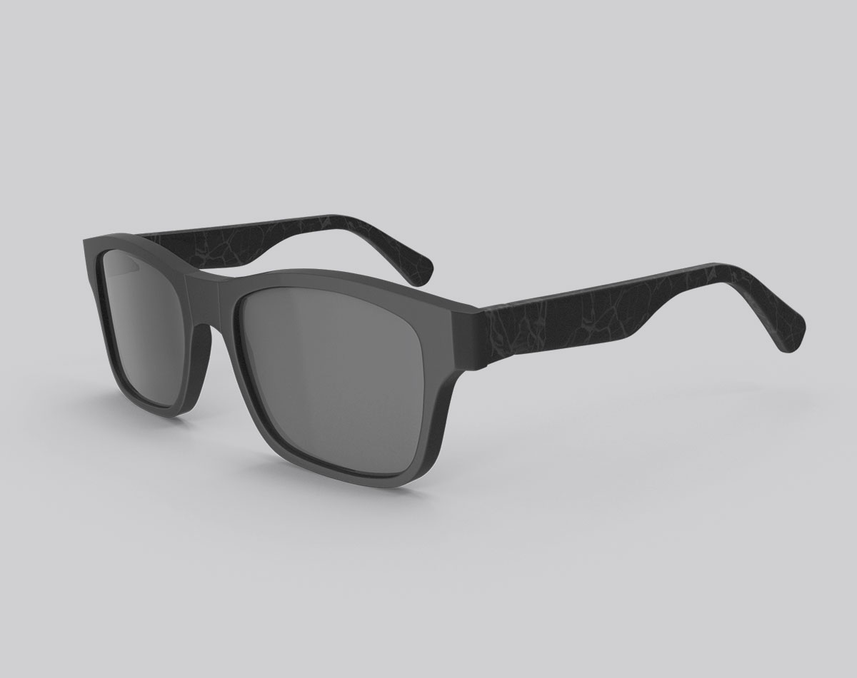
Each signature style of sunglasses has been paired with a unique logotype, colour pallet, and repetitive pattern.

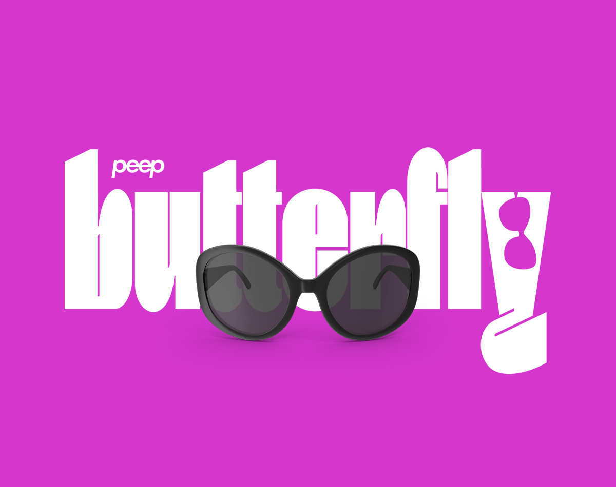
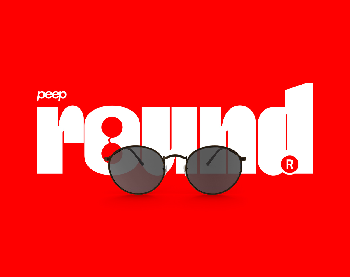
VISUAL IDENTITY
The visual identity does away with what people come to expect from its larger more established competitors. At its core, Peep’s visual language is built around the styles of the 80s and 90s, which have been updated for the modern era. This is evident with the expressive use of colours and the non-confirmative display of type. Peep’s core demographic is more and more becoming infatuated with retro styling, from the clothes they wear to the music they listen to… so why not give the people what they want?
Each signature style of sunglasses has been paired with a unique logotype, colour pallet, and repetitive pattern.
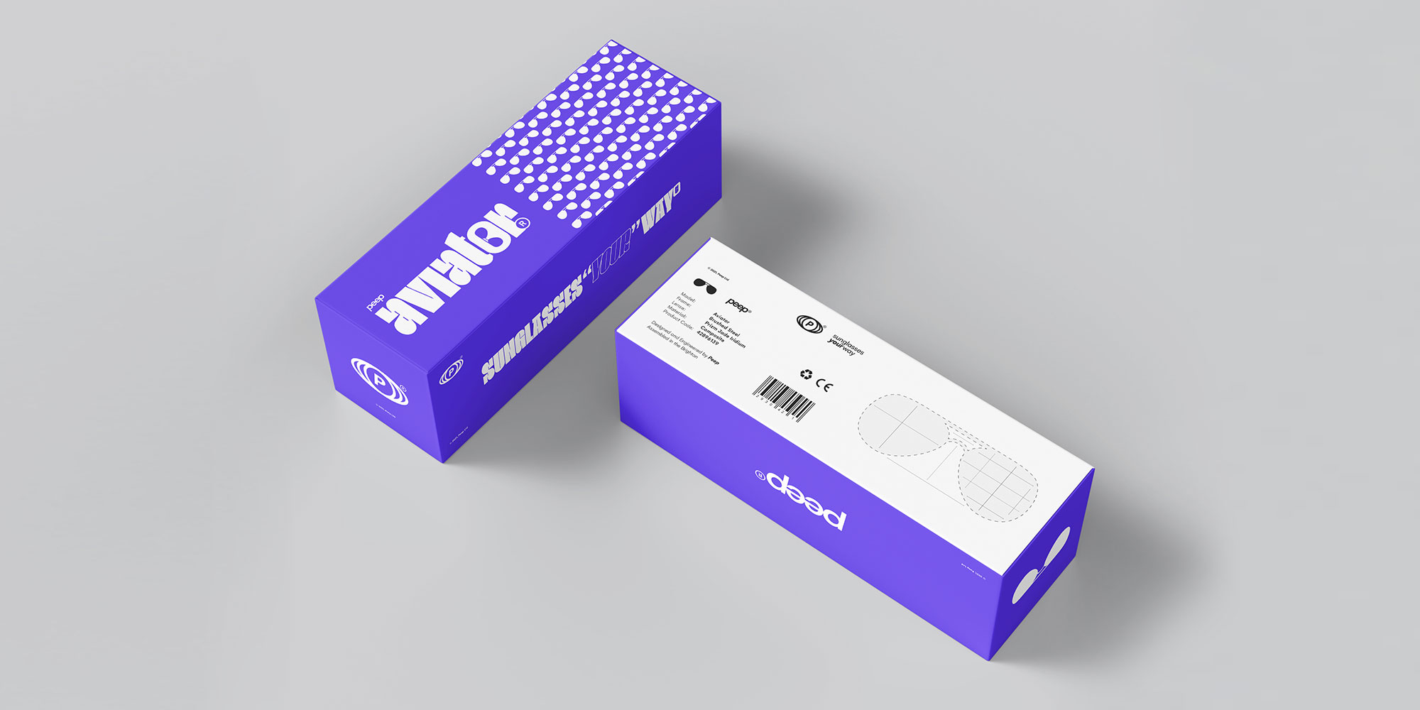
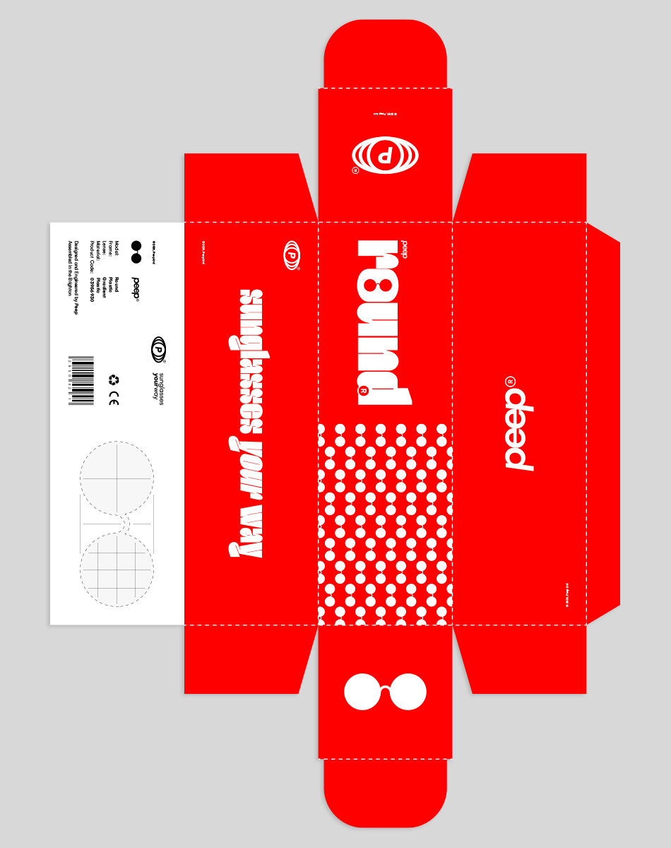
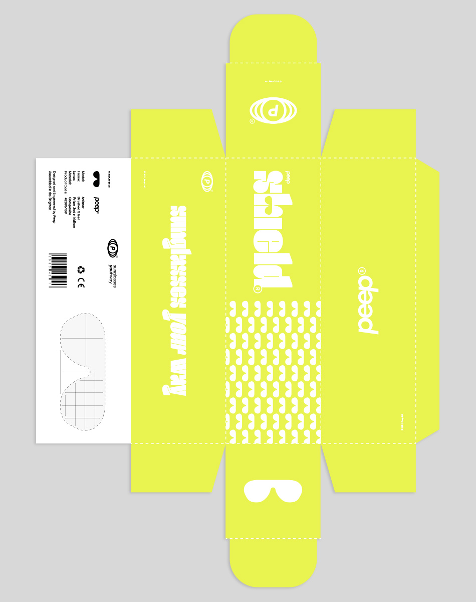
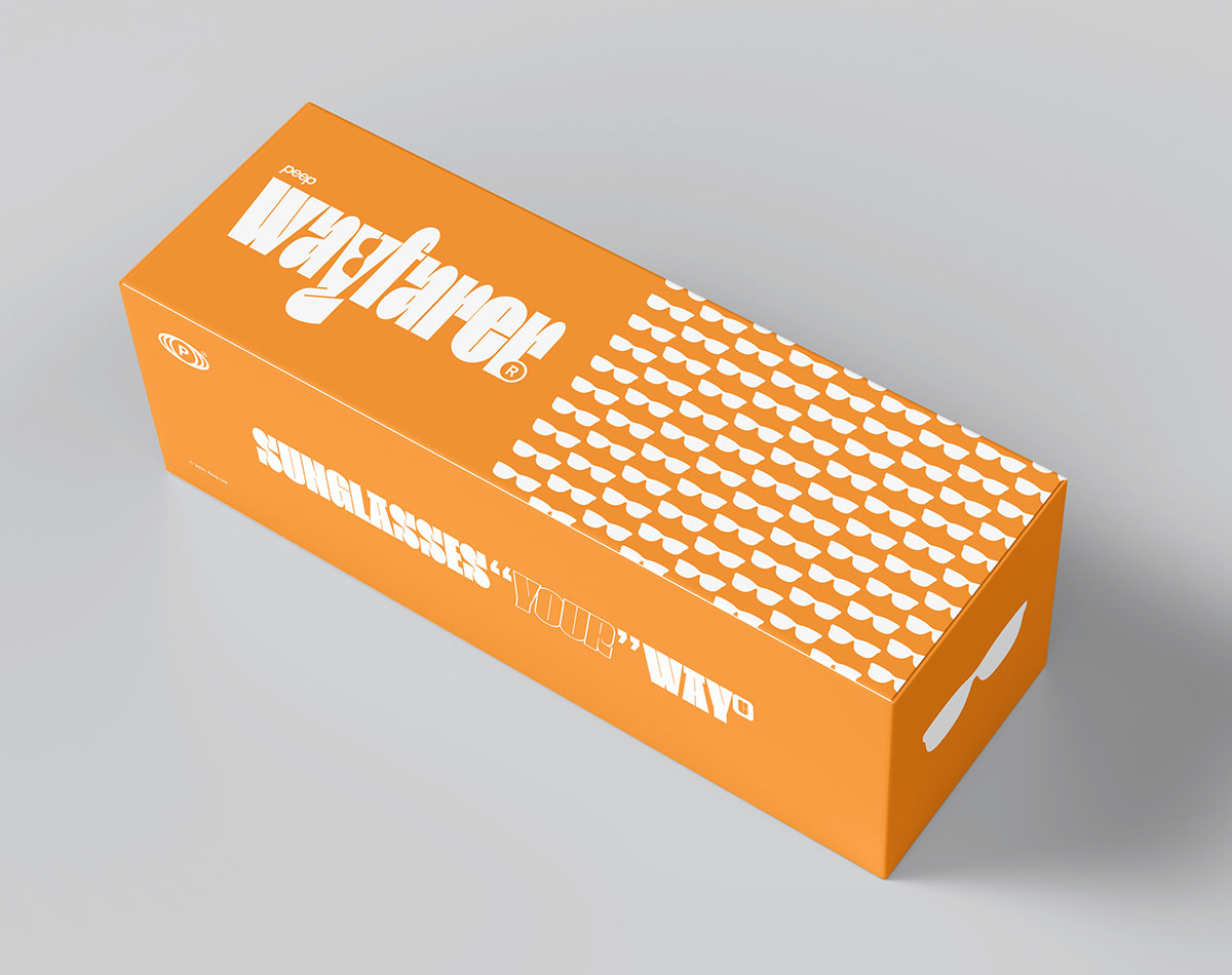
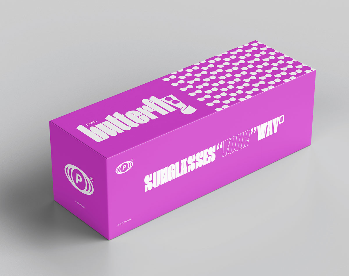
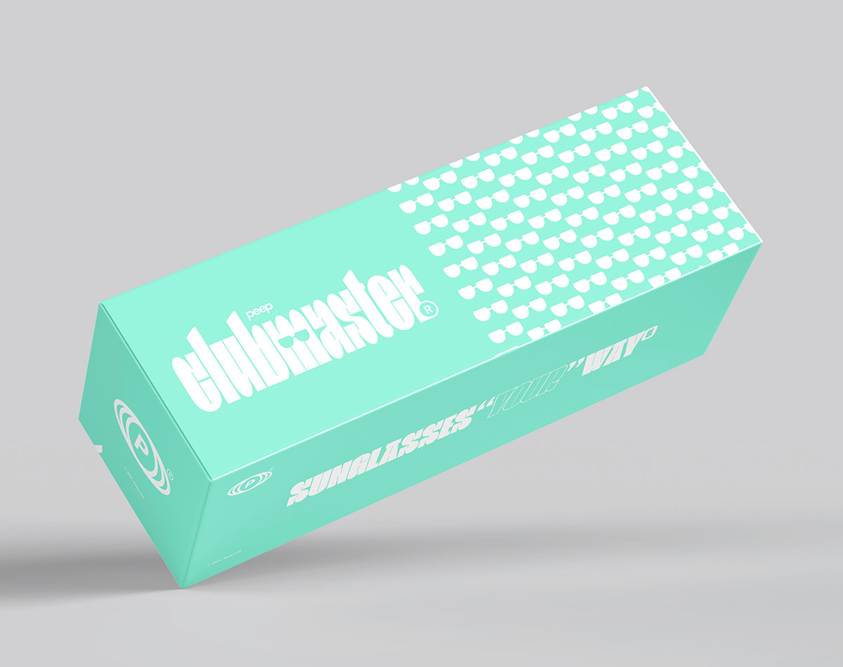

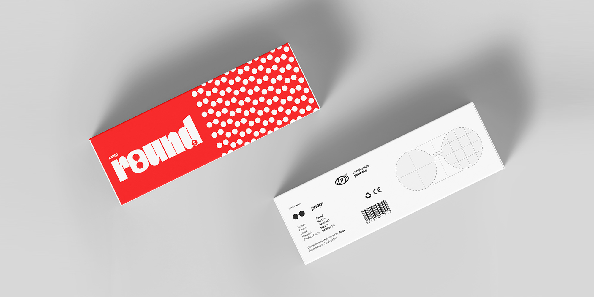
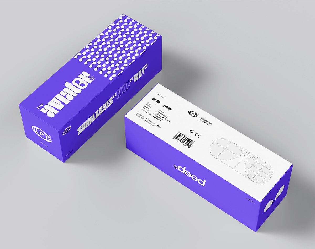
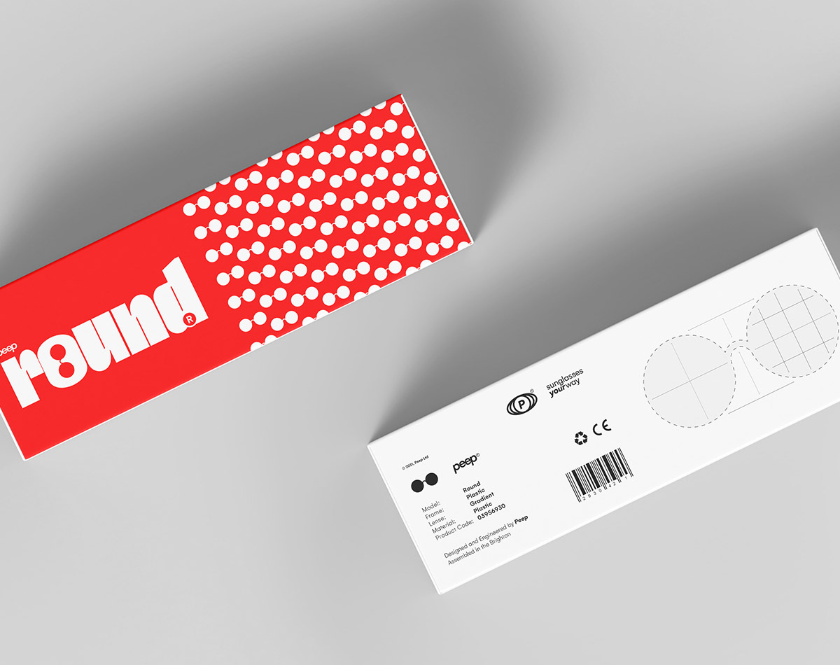
PACKAGING
Peep’s identity rebels against the boring, the same is much the case for its packaging, you won’t find a plain white box here. The packaging design is Peep’s purest extension of its visual styling, every box packs a punch.
Each box carries the product name as well as a repetitive graphic of the product itself. This is paired with generous helpings of colour and bold typographic elements. When combined, each piece of packaging stands out from the crowd.
Other features include the brand’s slogan, logo, and further product information.
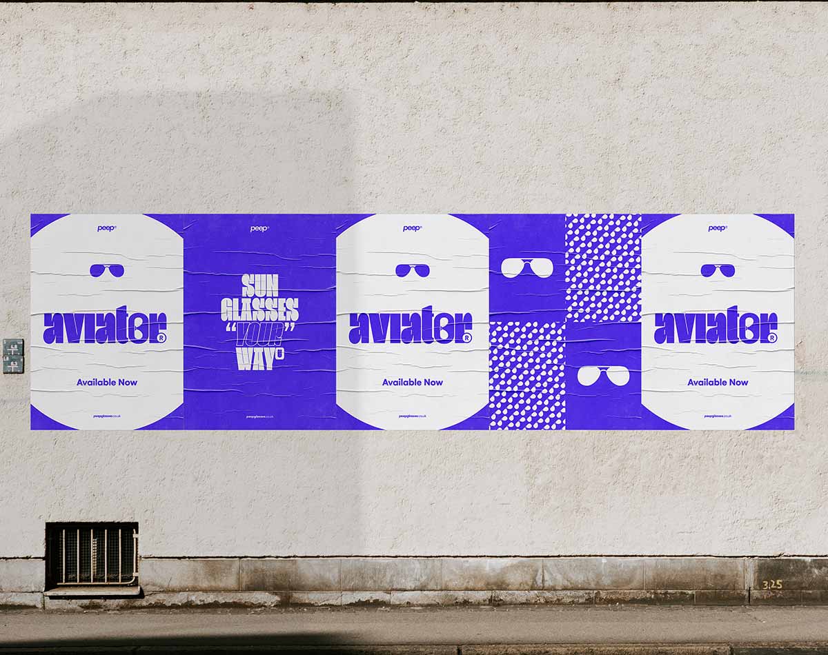
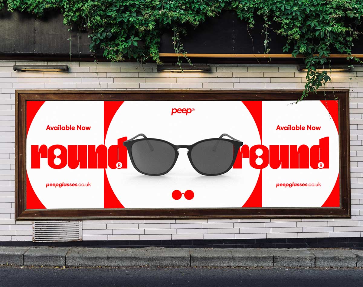
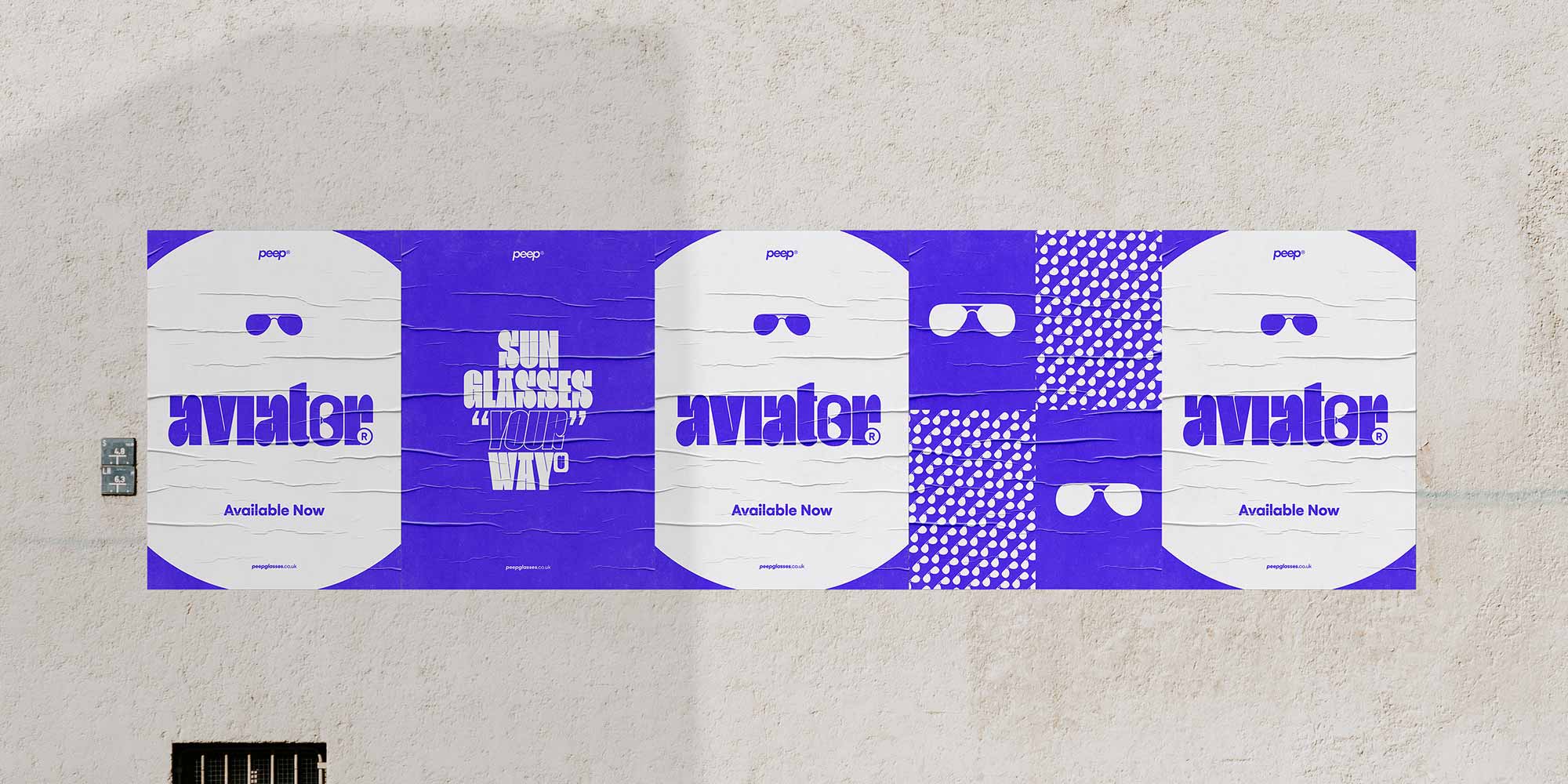
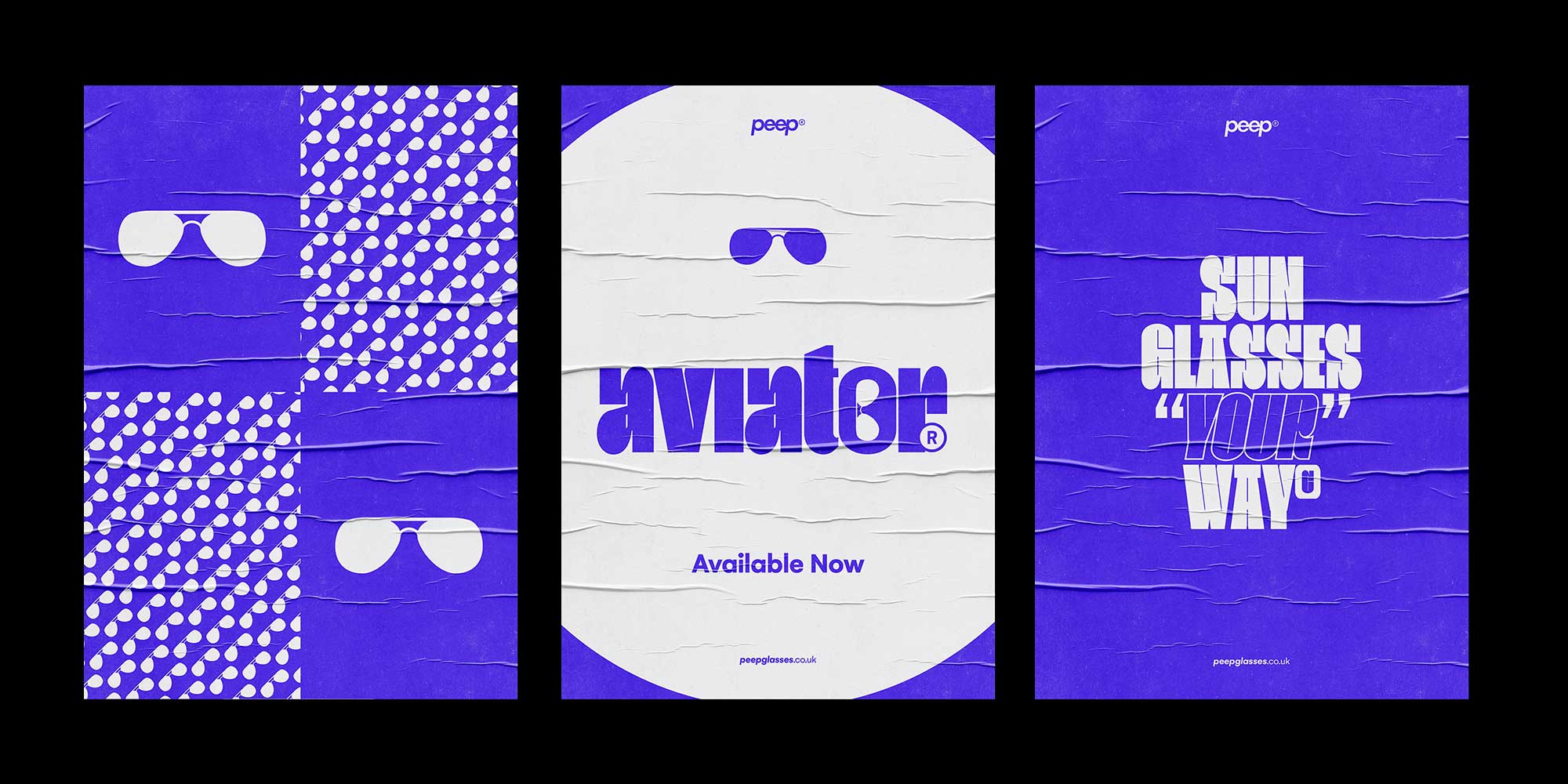
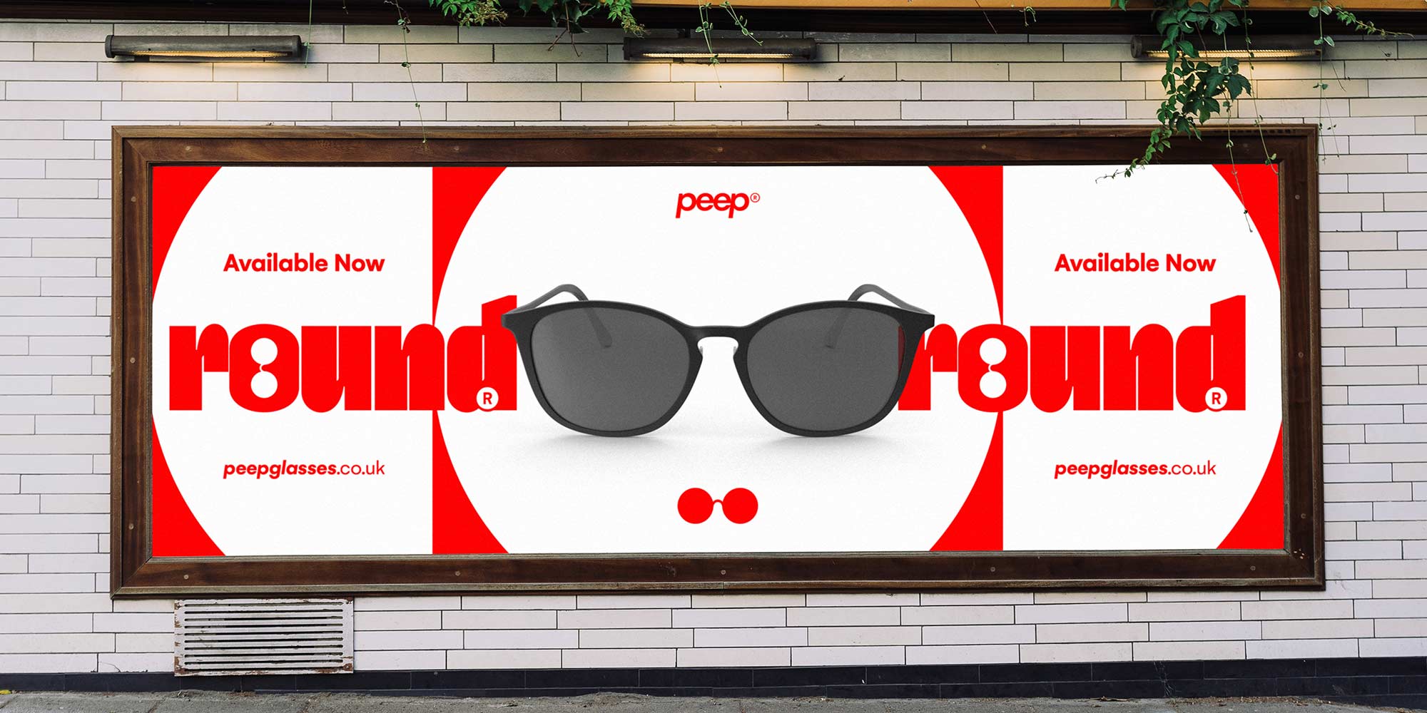
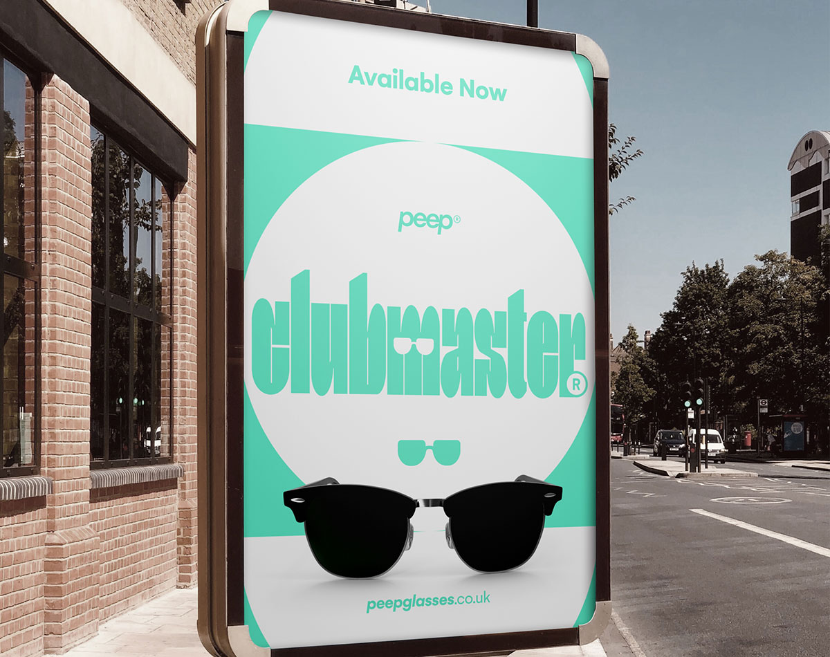
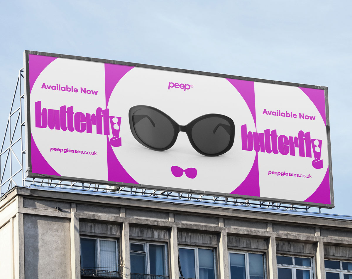
POSTERS AND SIGNAGE
To further boost public awareness of the brand, Peep required a run of posters and billboards with the intention of having these present within Urban areas of popular UK cities. Likewise, as with the previous material, each piece of advertising primarily promoted the product itself as opposed to the parent brand. This provided more of an opportunity to experiment with unique and expressive layouts. The Banners employed rounded shapes and layouts to draw attention to the product shots. With the smaller posters, we went for a more minimal (yet equally as bold) interpretation of the product by creating a direct link with the packaging design itself.