Campaign concept and visual identity for forward thinking, enviro-friendly organisation OFFSHORE.
SERVICES
Branding, Typography, Visual Identity, Web Design
CLIENT
Offshore
DATE
February 2022
THE BRAND
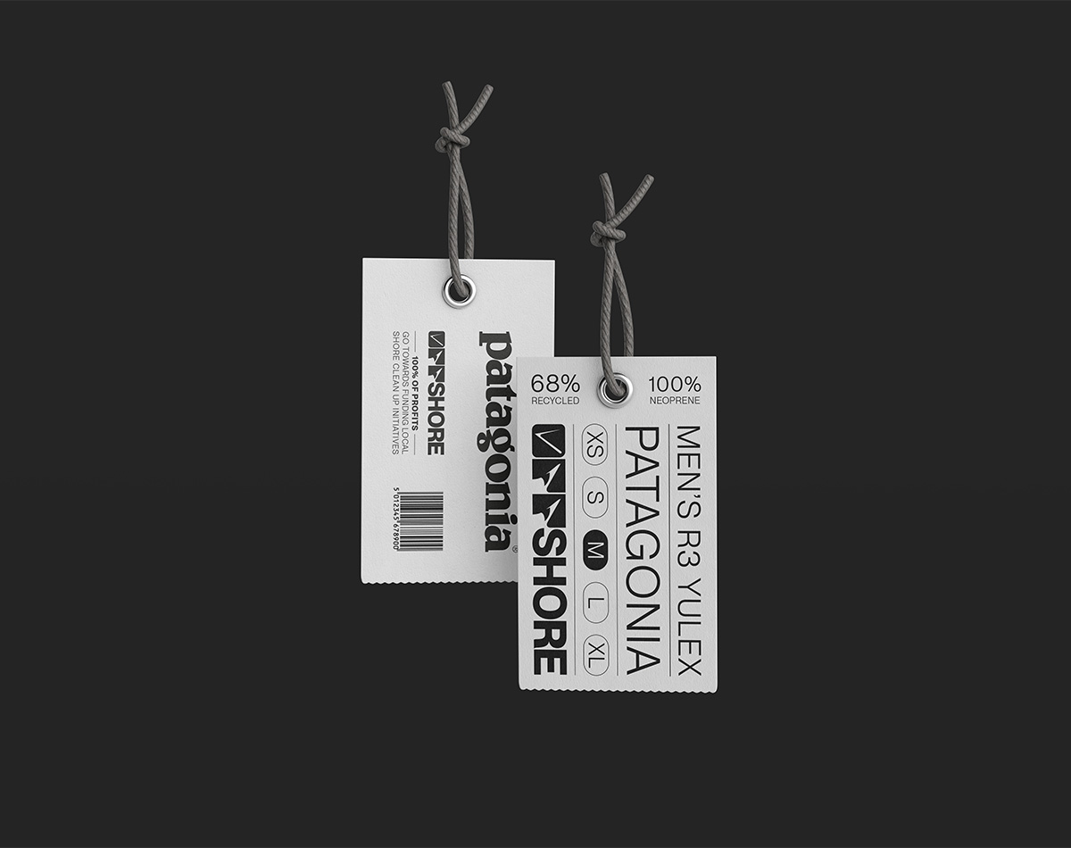
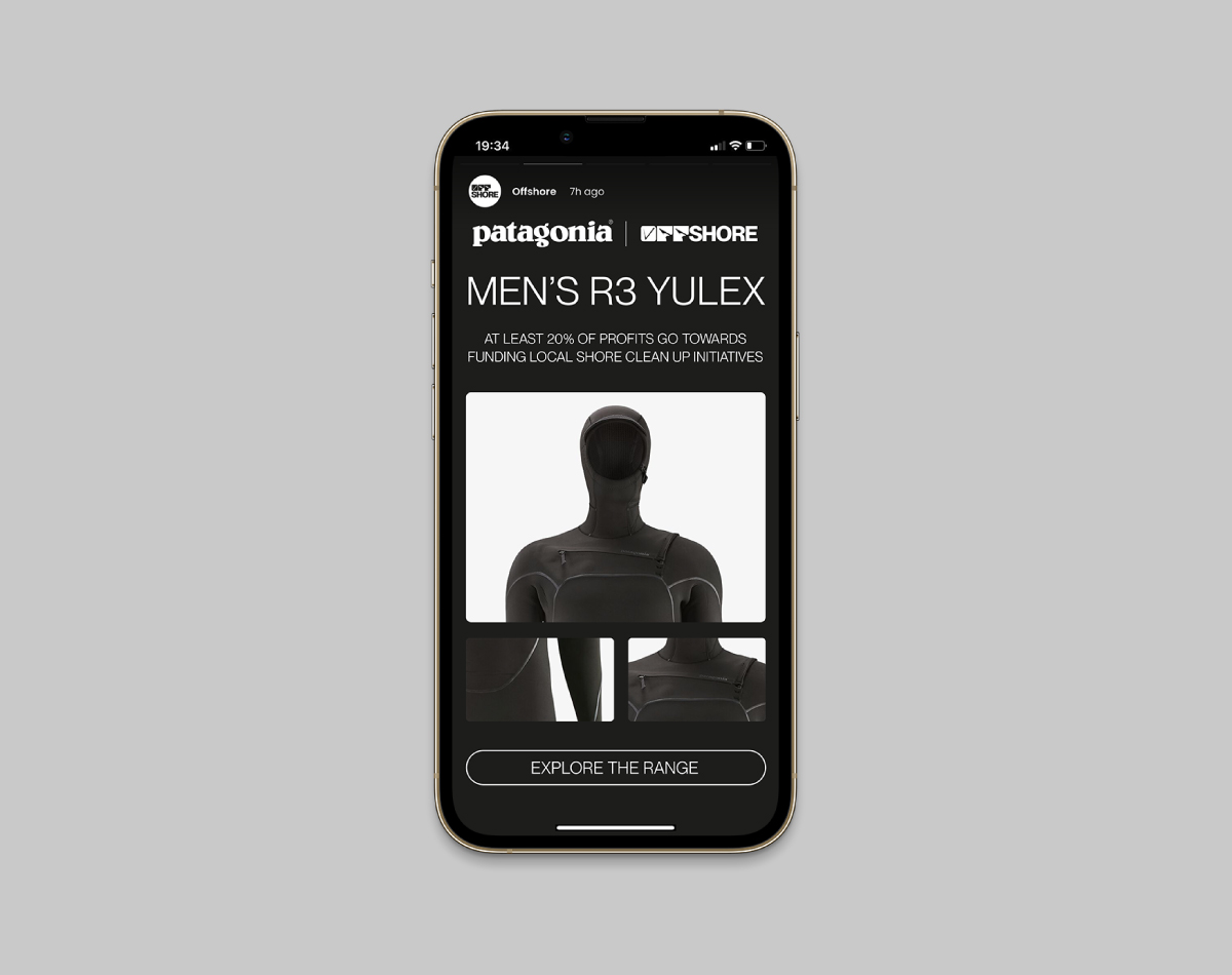
OFFSHORE is a UK-based organisation with a unique approach to coastline conservation. As opposed to simply disposing of the waste found on our shorelines, the organisation has partnered with some of the biggest names in the watersports industry to repurpose this waste. Transforming it from apparent junk, into sustainable and desirable surf wear. Profits from these products are in turn used to support coastline conservation projects and educate those who are ignorant of the dangers that our oceans face.
THE PROBLEM
Despite having an ‘relevant’ objective and a loyal core audience, OFFSHORE lacked the presence or outwards personality to expand its reach to a national scale. They needed an identity that both packed a punch and conveyed the sincerity of their cause.
THE SOLUTION
The Visual Identity for OFFSHORE had to be bold and on-trend, while also being versatile enough to work alongside other brands. Therefore, a clean logo mark was created which harmonises the energy of the ocean, and the sincerity of the organisation’s mission. A high contrast colour palette is brought into the brand via the use of expressive (and sometimes shocking) imagery. This is paired with a clean typographic style and gutsy brand messaging.
Campaign concept and visual identity for forward thinking, enviro-friendly organisation OFFSHORE.
SERVICES
Branding, Typography, Visual Identity, Web Design
CLIENT
Offshore
DATE
February 2022
THE BRAND
OFFSHORE is a UK-based organisation with a unique approach to coastline conservation. As opposed to simply disposing of the waste found on our shorelines, the organisation has partnered with some of the biggest names in the watersports industry to repurpose this waste. Transforming it from apparent junk, into sustainable and desirable surf wear. Profits from these products are in turn used to support coastline conservation projects and educate those who are ignorant of the dangers that our oceans face.
THE PROBLEM
Despite having an ‘relevant’ objective and a loyal core audience, OFFSHORE lacked the presence or outwards personality to expand its reach to a national scale. They needed an identity that both packed a punch and conveyed the sincerity of their cause.
THE SOLUTION
The Visual Identity for OFFSHORE had to be bold and on-trend, while also being versatile enough to work alongside other brands. Therefore, a clean logo mark was created which harmonises the energy of the ocean, and the sincerity of the organisation’s mission. A high contrast colour palette is brought into the brand via the use of expressive (and sometimes shocking) imagery. This is paired with a clean typographic style and gutsy brand messaging.
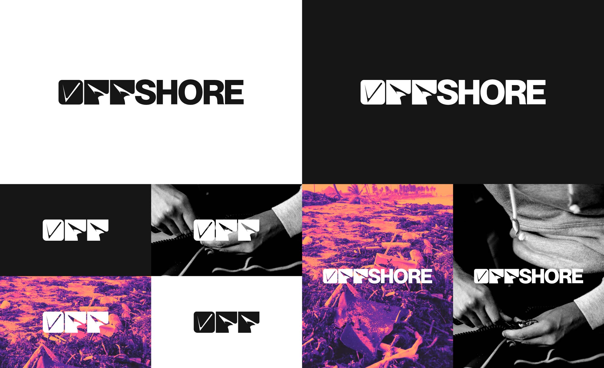
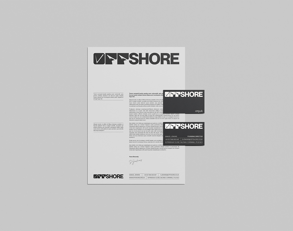
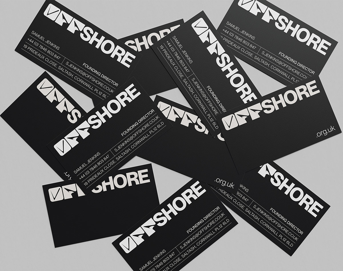
VISUAL IDENTITY
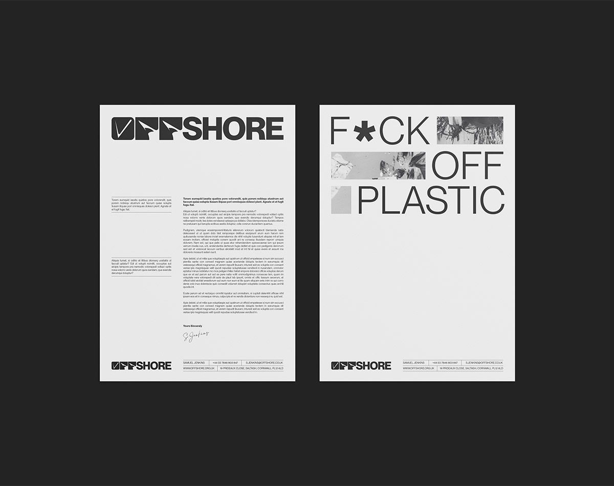
The logotype was designed to reflect the energy of OFFSHORE’s core demographic while also being representative of its objective. Ultimately, two distinctive typefaces were combined to bridge the gap between the two. The fluidity of ‘OFF’ is symbolic of the ocean and its waveforms, while the rigidity of ‘SHORE’ grounds it and adds a serious tone. The combination of which succeeds in creating an exciting logotype that is both impactful and very versatile. It treads the line between a surf apparel brand and a world-changing organisation.
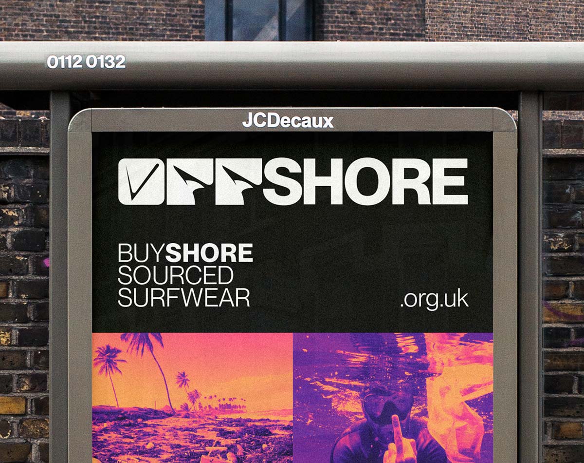
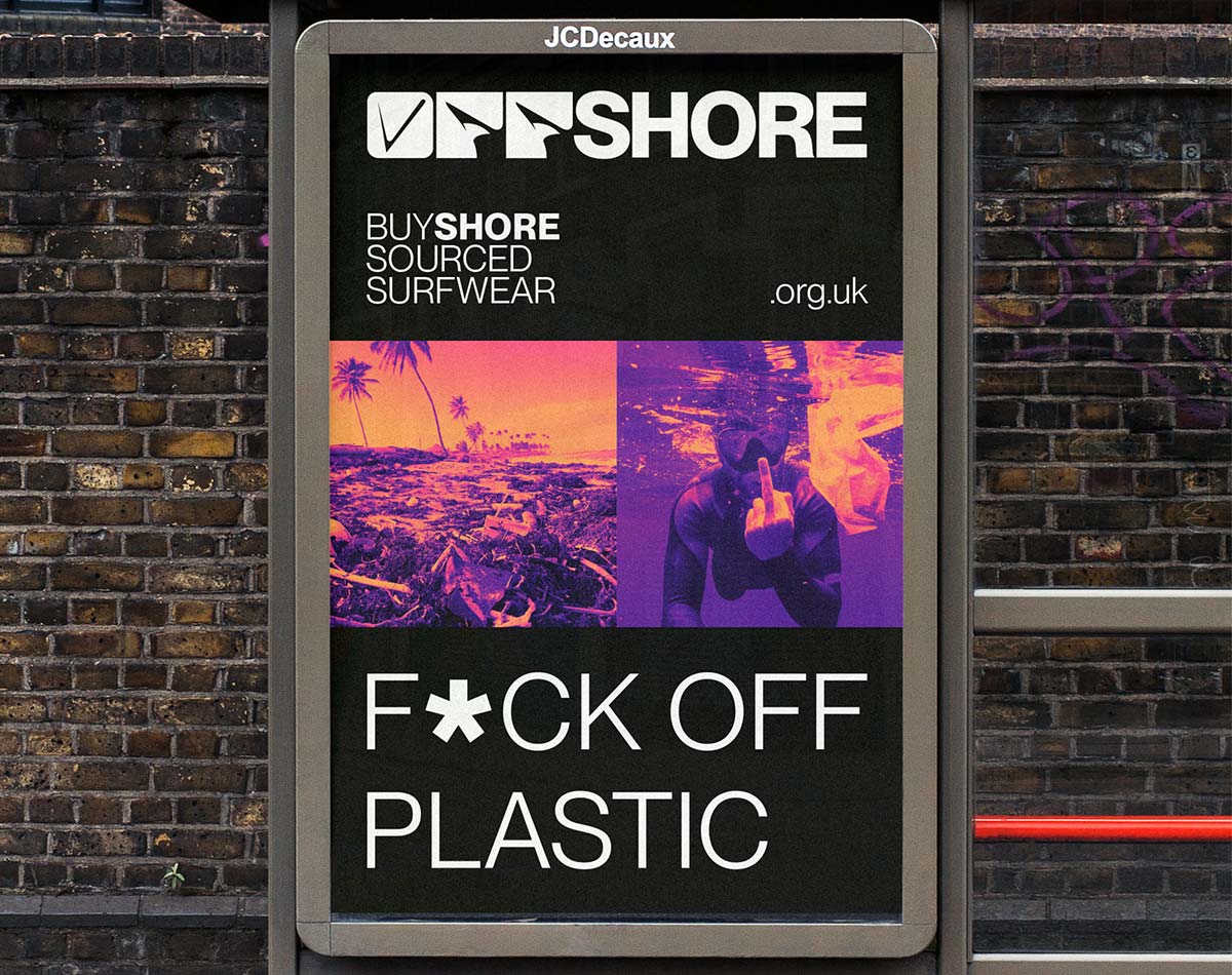
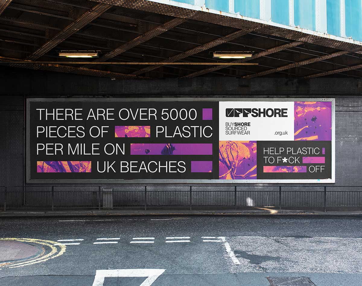
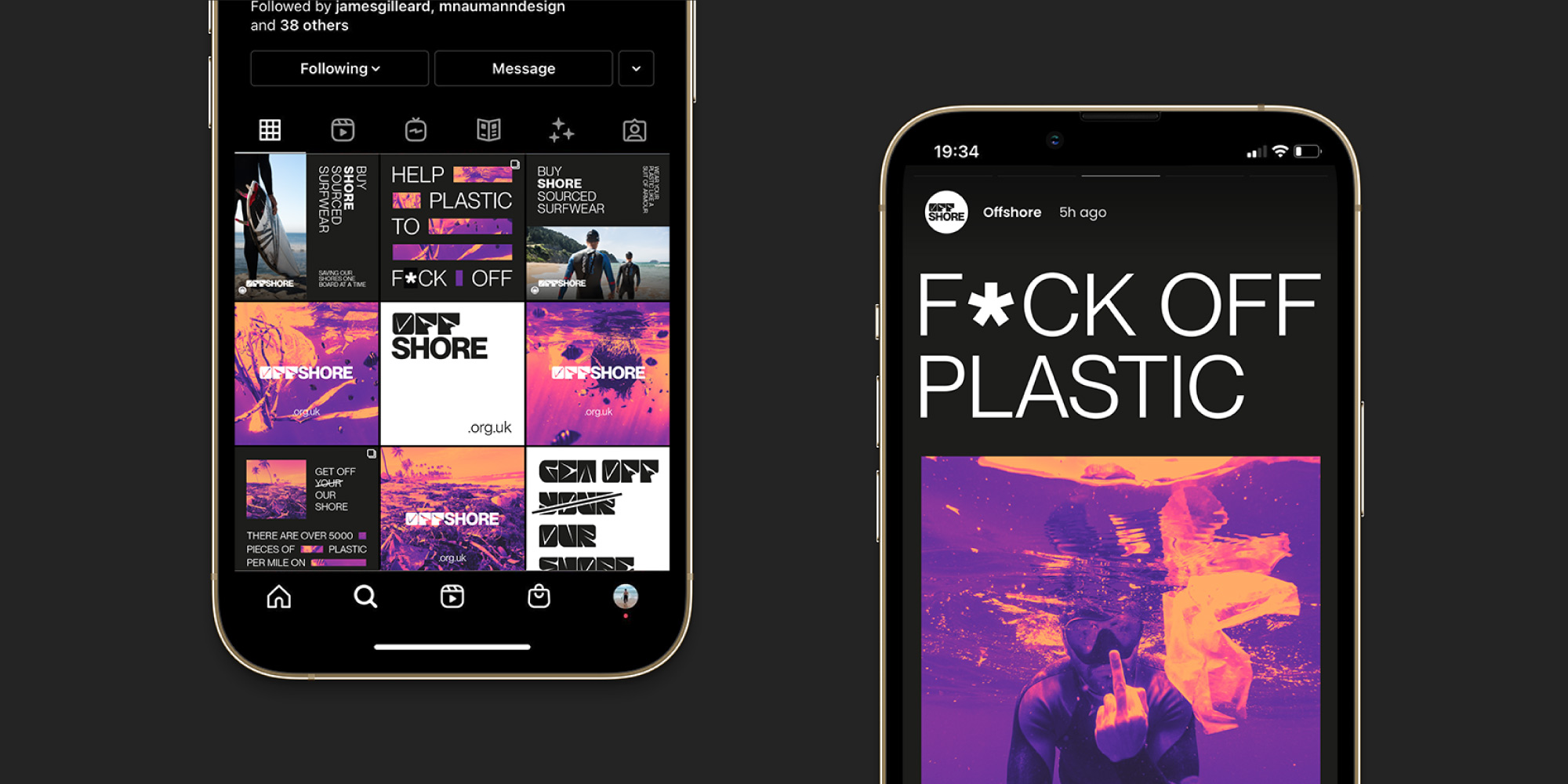
As an organisation, OFFSHORE doesn’t beat around the bush when articulating the impact that humans have on the ocean. As such, the logotype is paired with a collection of hard-hitting and provoking imagery that further adds to the sincerity of the cause. These images feature scenes of plastic waste along shorelines and floating within ocean habitats. Alongside this, a contrasting duotone palette is used often to further add distinction and a sense of danger. These tones are purposely reminiscent of the colours created when the sun sets over the ocean.
VISUAL IDENTITY
The logotype was designed to reflect the energy of OFFSHORE’s core demographic while also being representative of its objective. Ultimately, two distinctive typefaces were combined to bridge the gap between the two. The fluidity of ‘OFF’ is symbolic of the ocean and its waveforms, while the rigidity of ‘SHORE’ grounds it and adds a serious tone. The combination of which succeeds in creating an exciting logotype that is both impactful and very versatile. It treads the line between a surf apparel brand and a world-changing organisation.
As an organisation, OFFSHORE doesn’t beat around the bush when articulating the impact that humans have on the ocean. As such, the logotype is paired with a collection of hard-hitting and provoking imagery that further adds to the sincerity of the cause. These images feature scenes of plastic waste along shorelines and floating within ocean habitats. Alongside this, a contrasting duotone palette is used often to further add distinction and a sense of danger. These tones are purposely reminiscent of the colours created when the sun sets over the ocean.
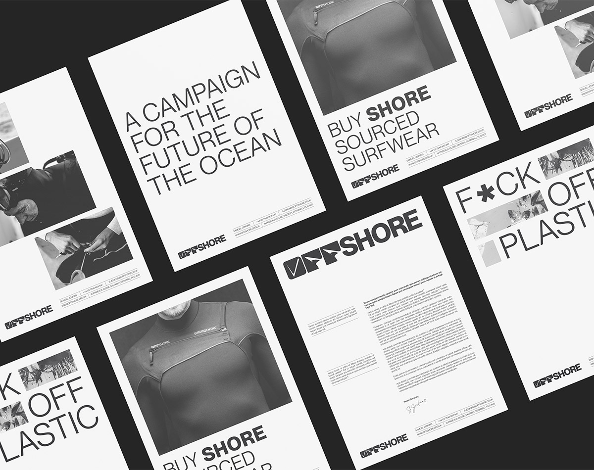
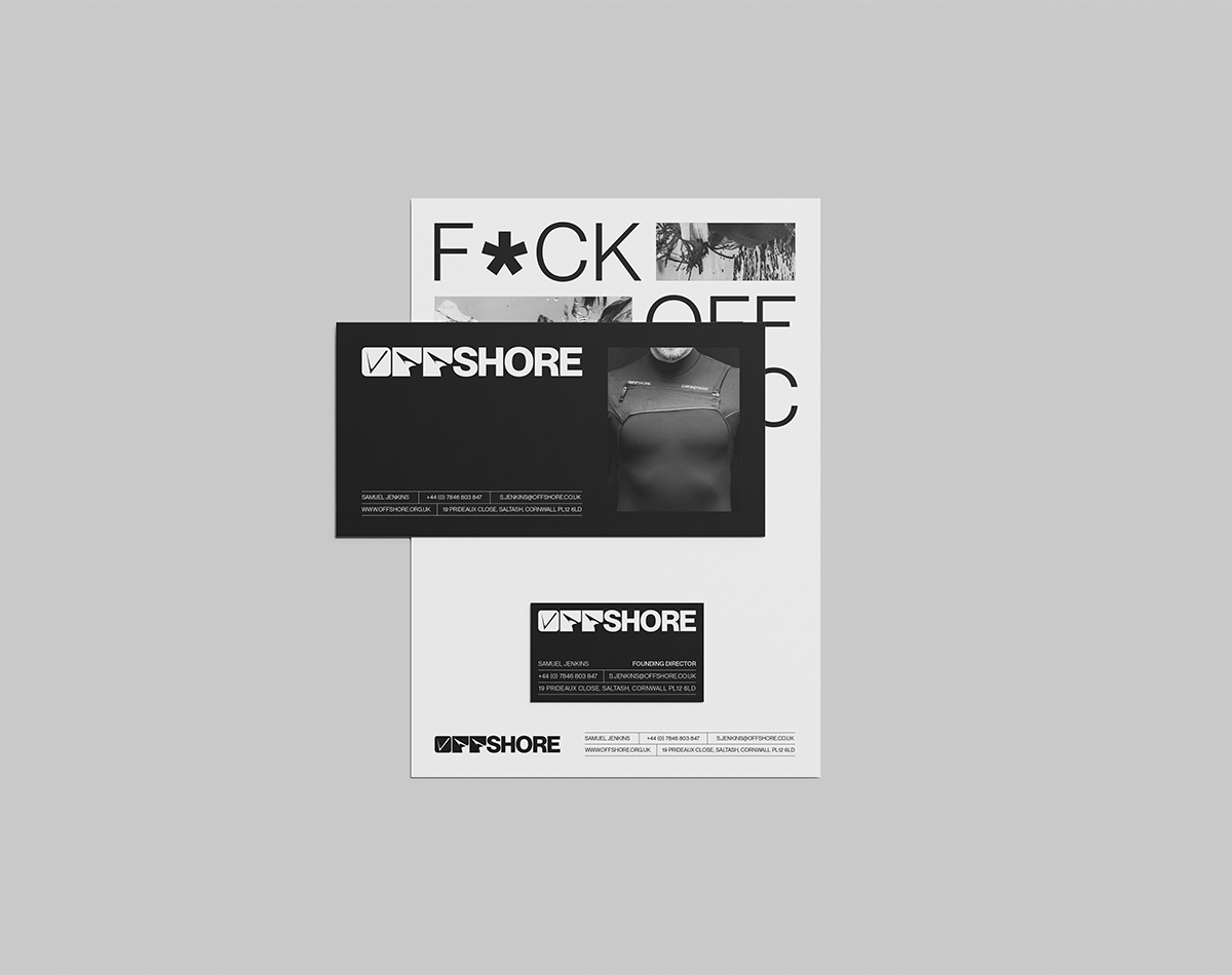
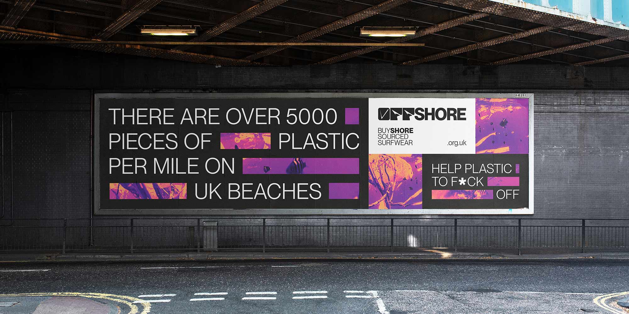
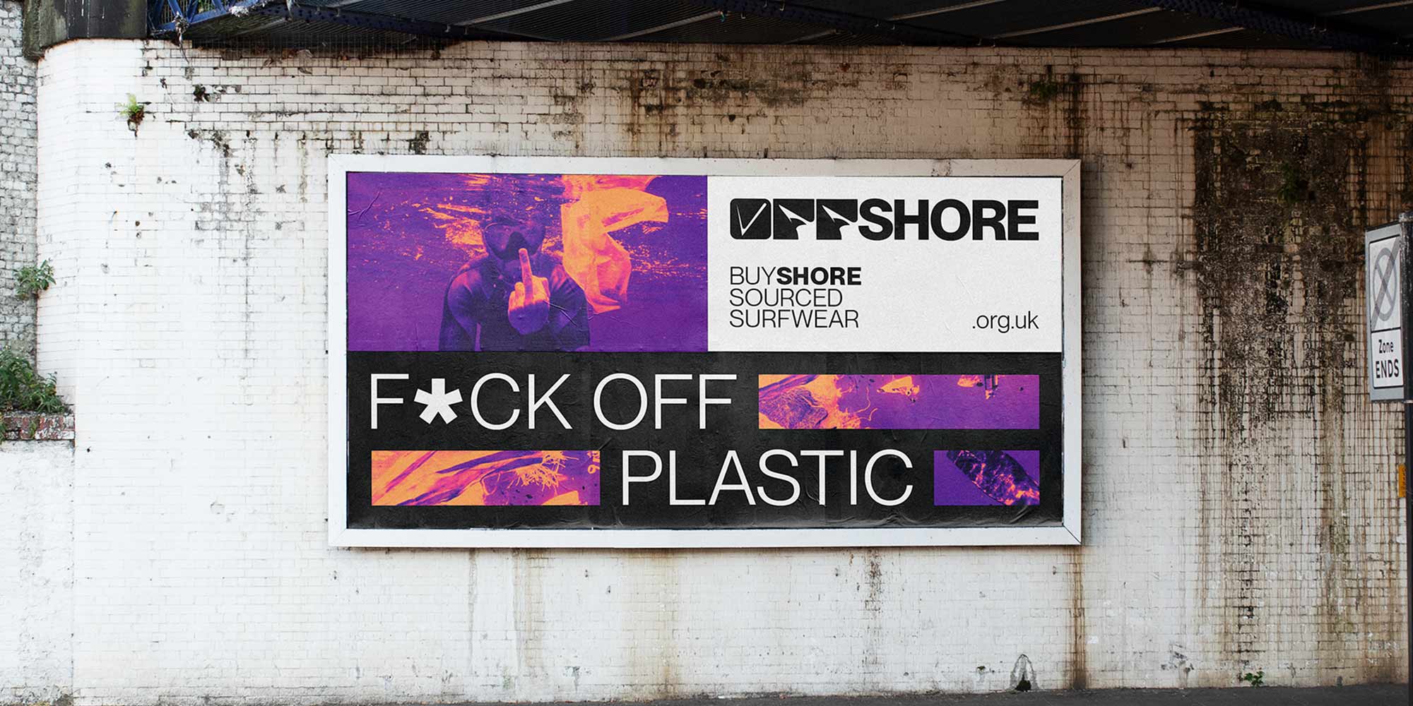
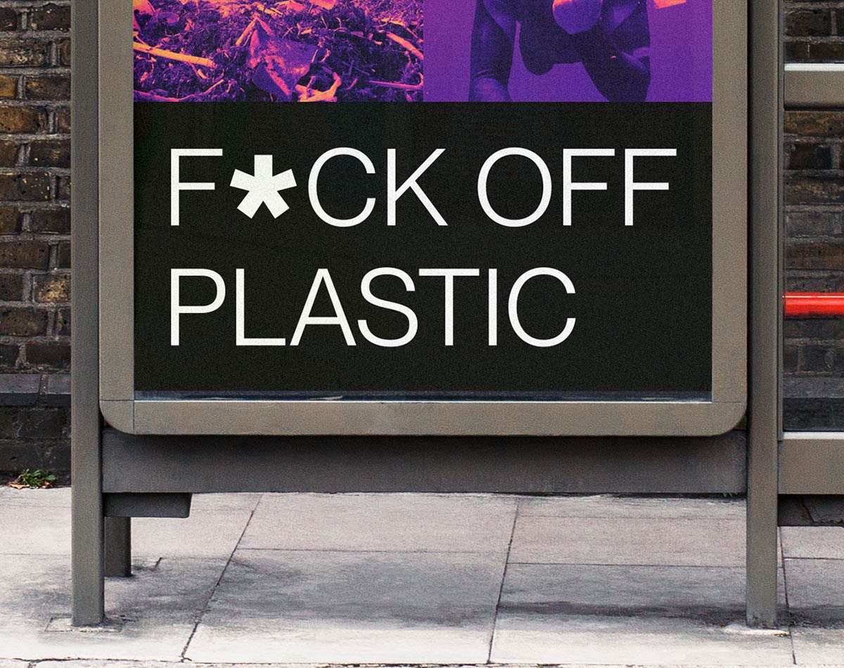
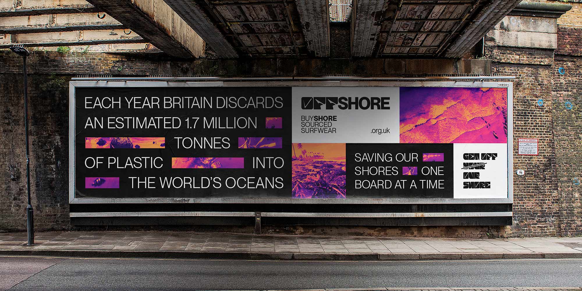
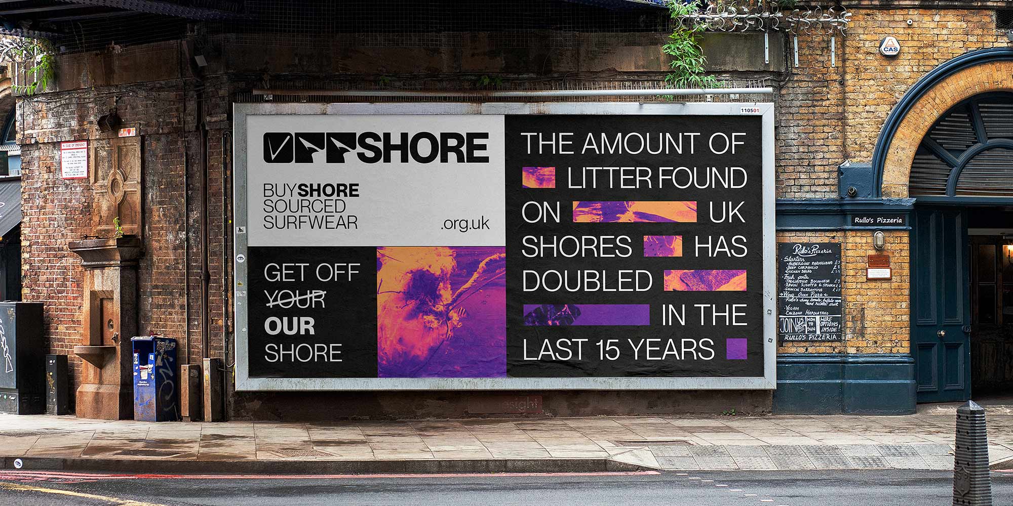
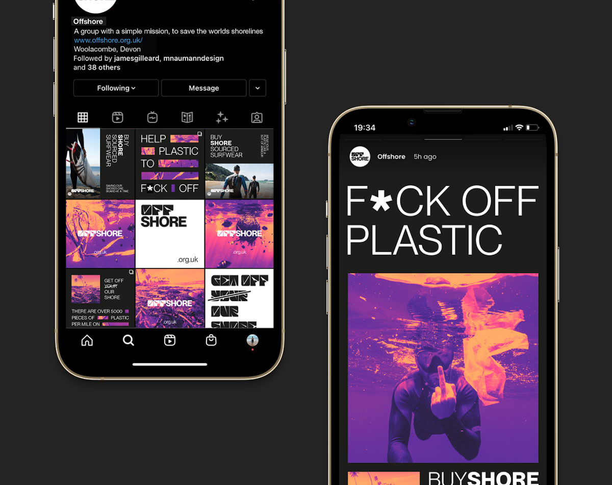
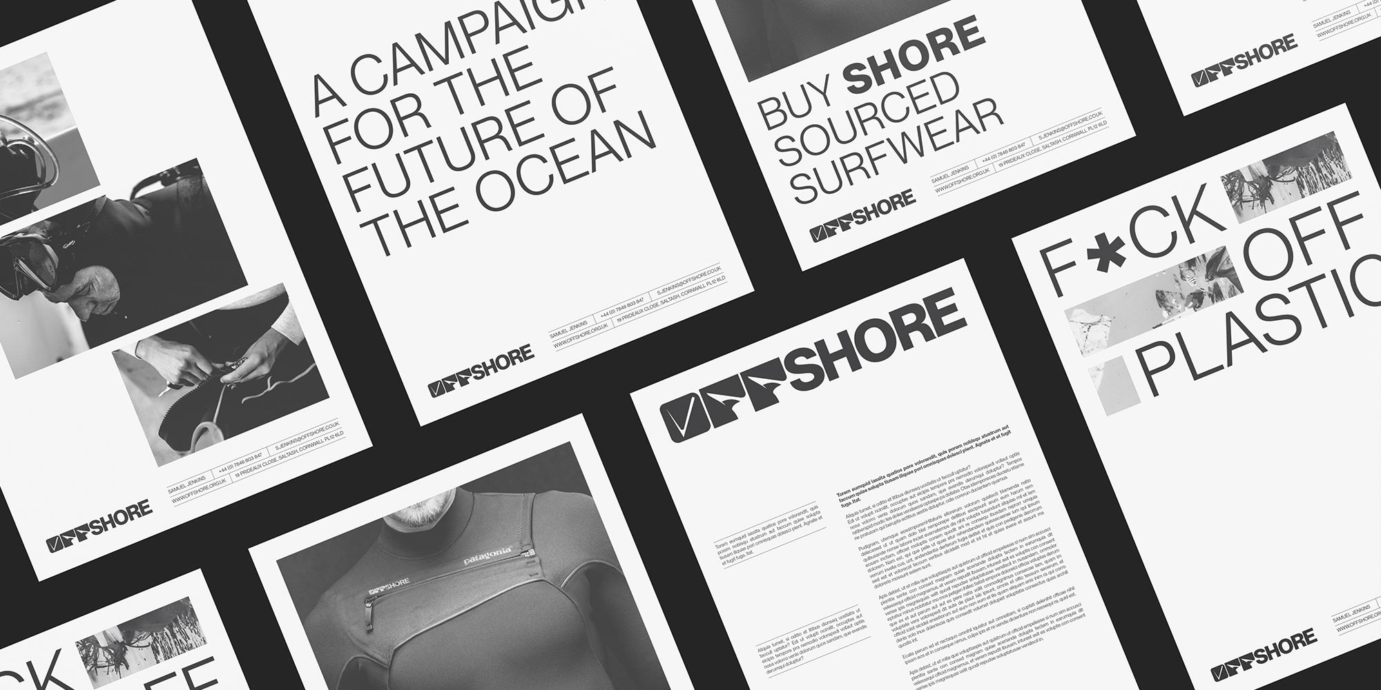
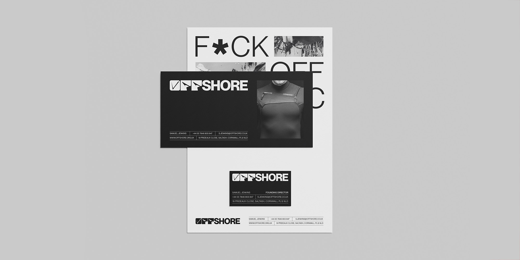
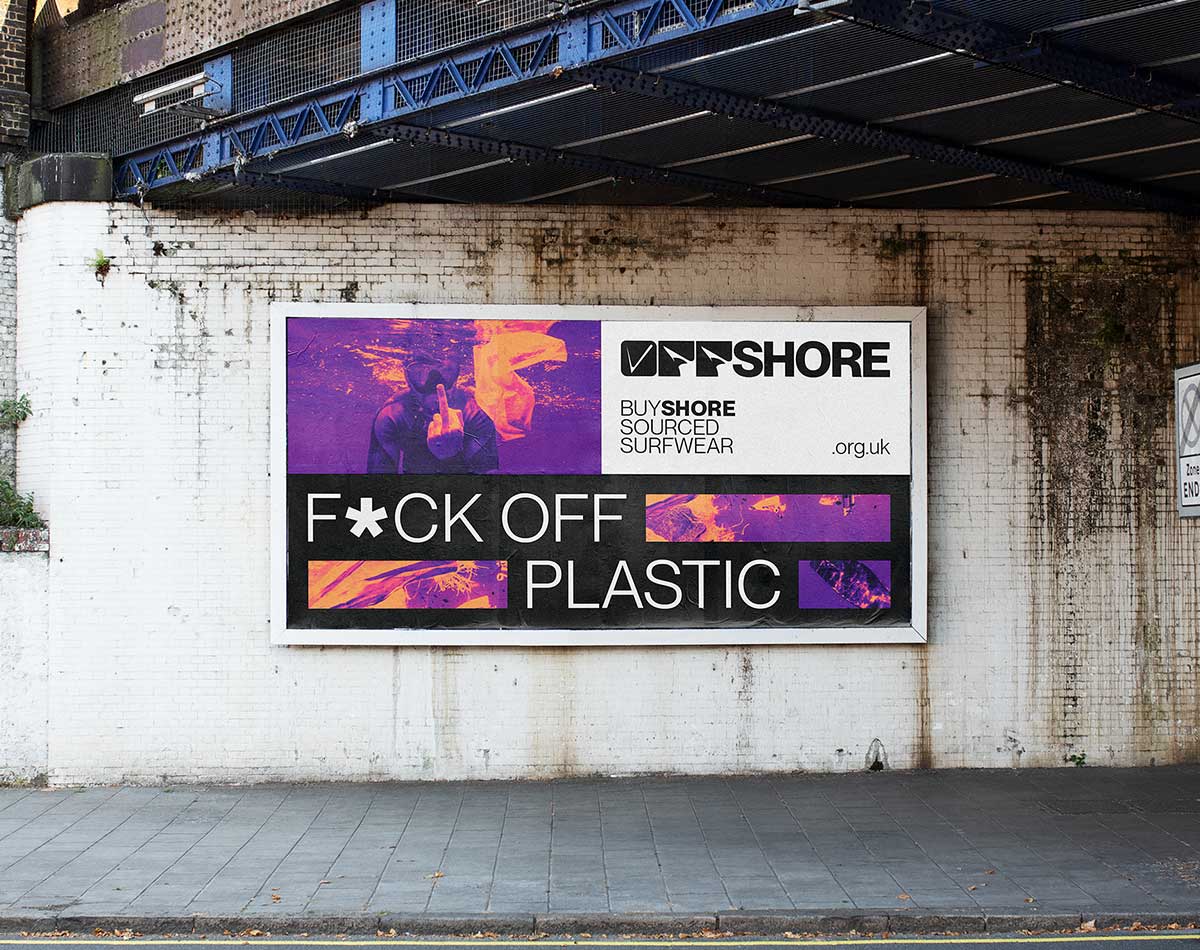
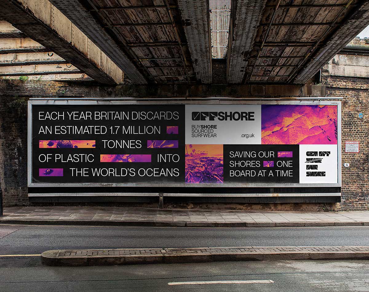
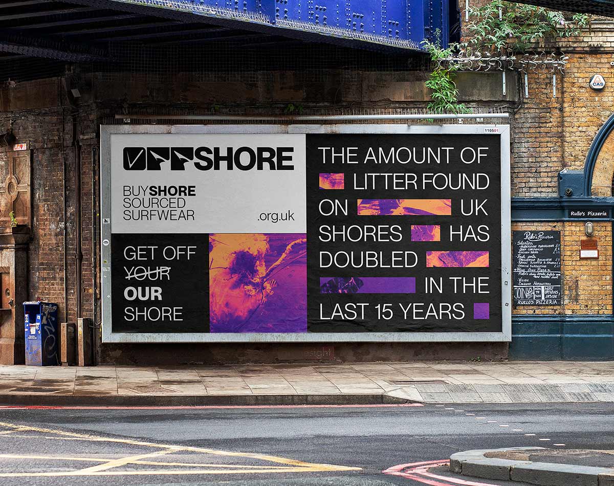
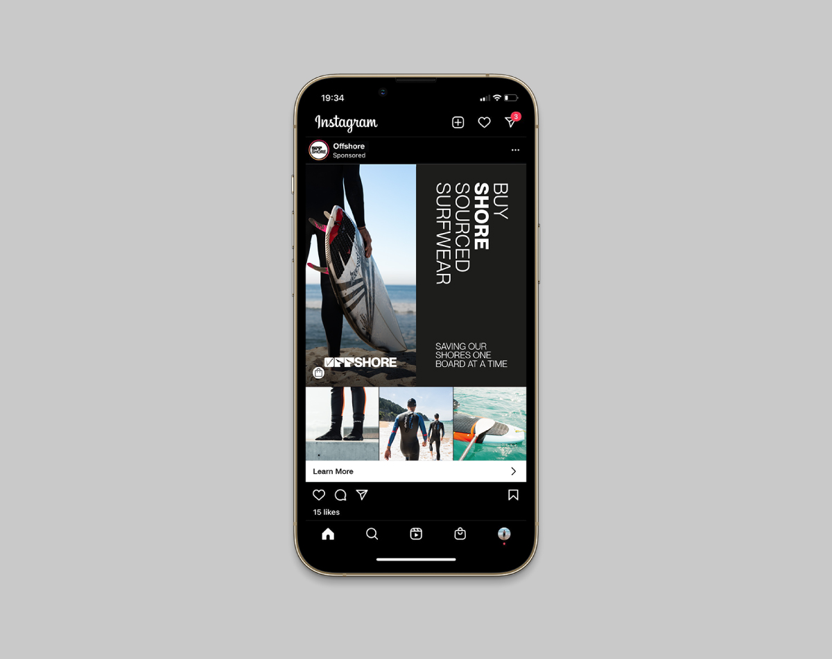
PROMOTION
Today’s media is saturated with climate change advertising. As such, Offshore required a different approach to cut through the noise. The brand’s messaging; which is prominent throughout its promotional material, is purposefully gutsy. It provides short snippets of factual information that are intended to shock passers-by and encourage action. The geometric grid-like format was designed to draw the eye to the most important information first, then gradually lead it to the call to action. This design language is versatile and can be utilised across a variety of applications.
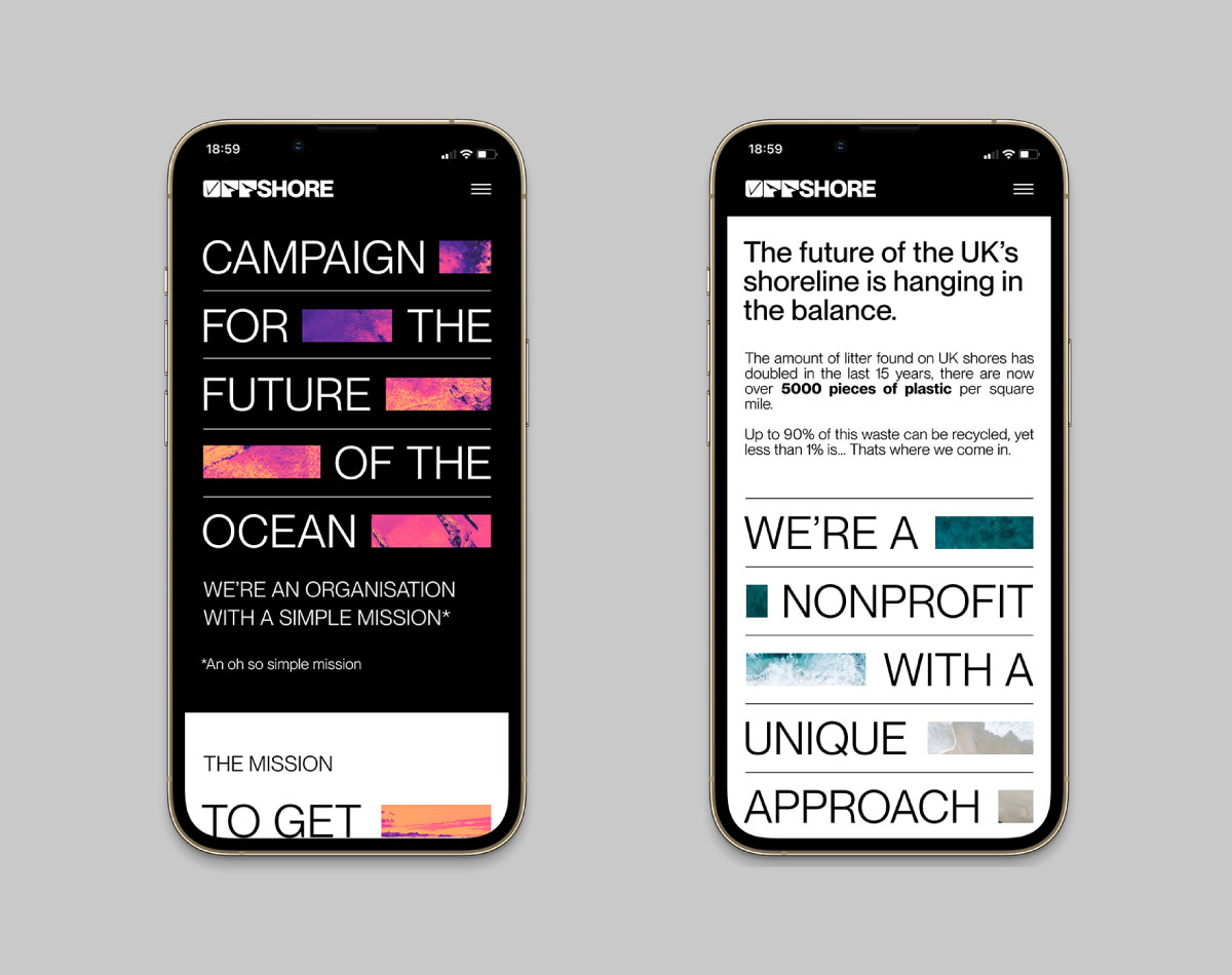
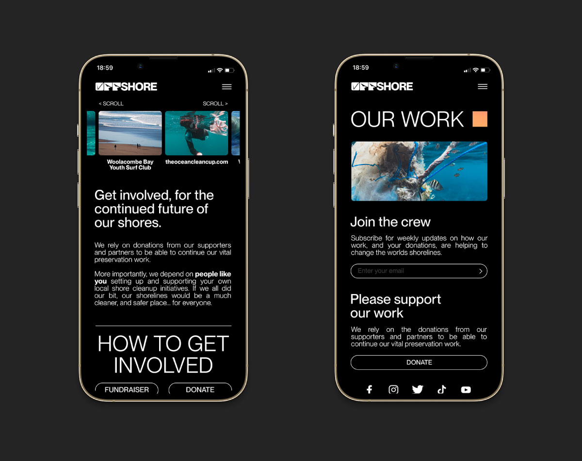
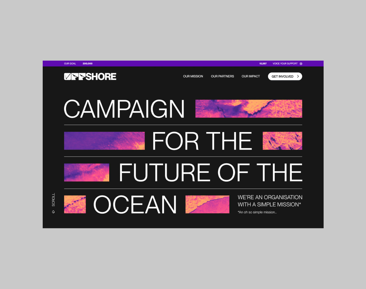
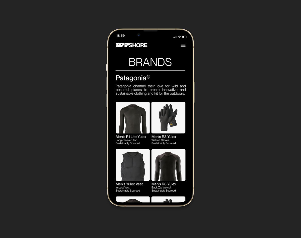
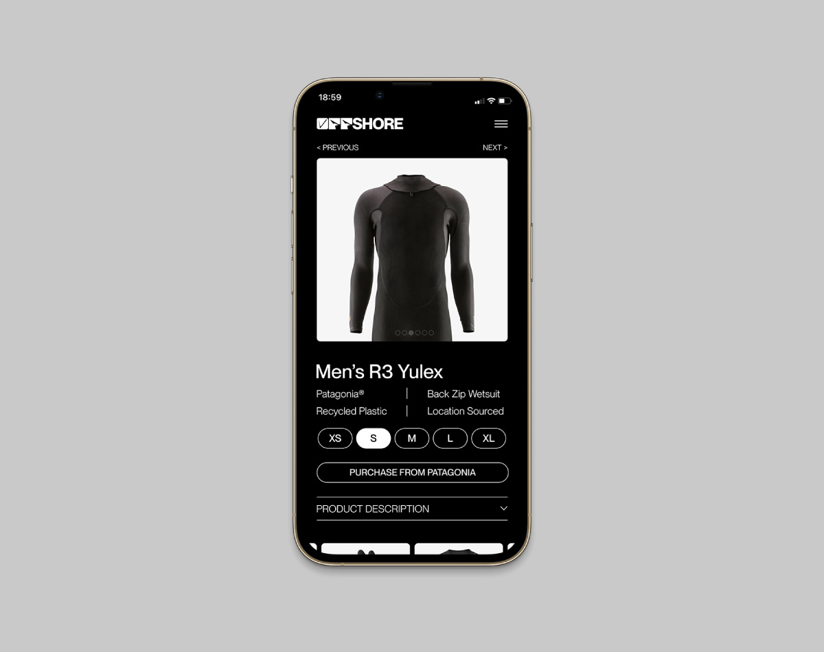
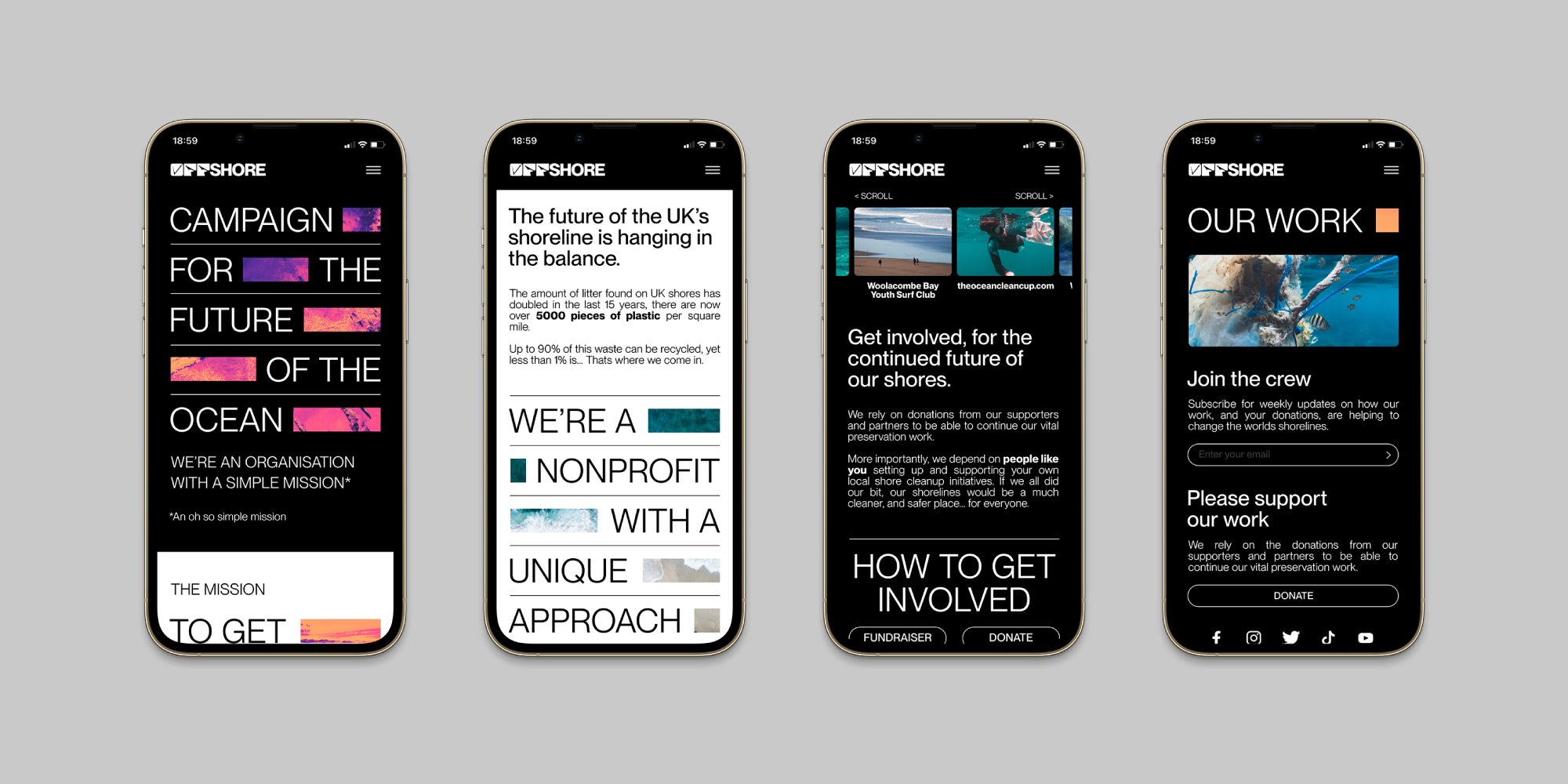
DIGITAL
The website’s objectives were for it to be used to educate, fundraise and act as a platform from which to buy ‘shore sourced apparel’. Call-to-actions from the promotional campaign would direct people straight to this site. In keeping with the rest of Offshore’s branding, the website was designed to be as much of a visual journey as it was a functional platform. As such, many of the design elements from the physical campaign were brought forwards into the digital domain. The use of large type entwined with poignant imagery allowed for interesting compositions. This allowed further room to play with dynamic elements and features that made the website all the more interactive.
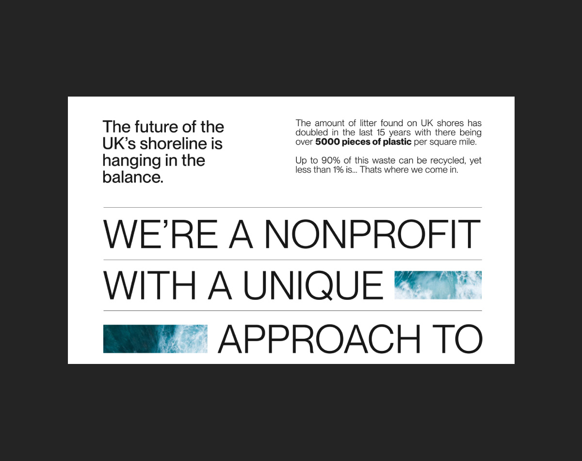
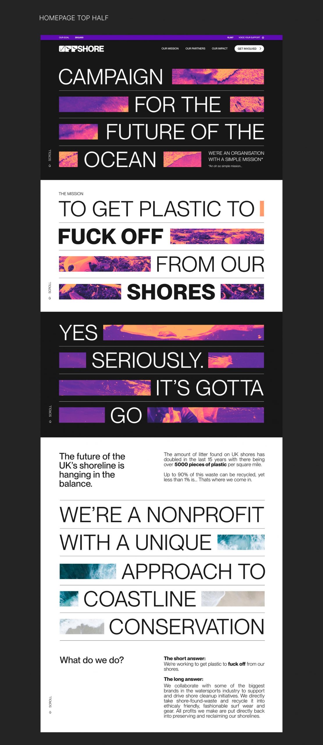
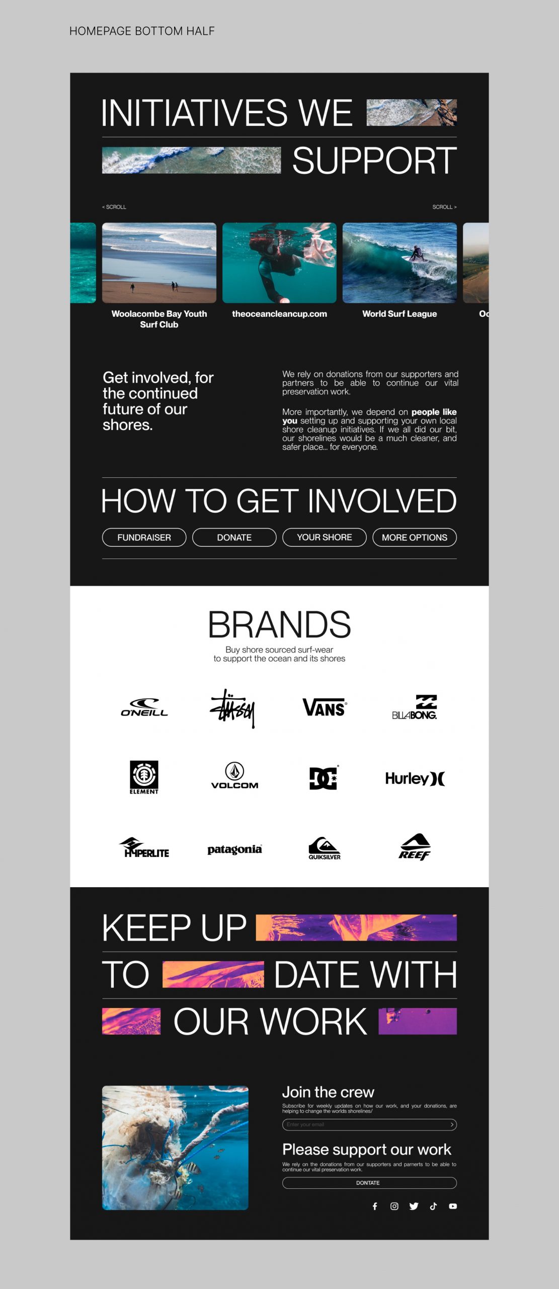
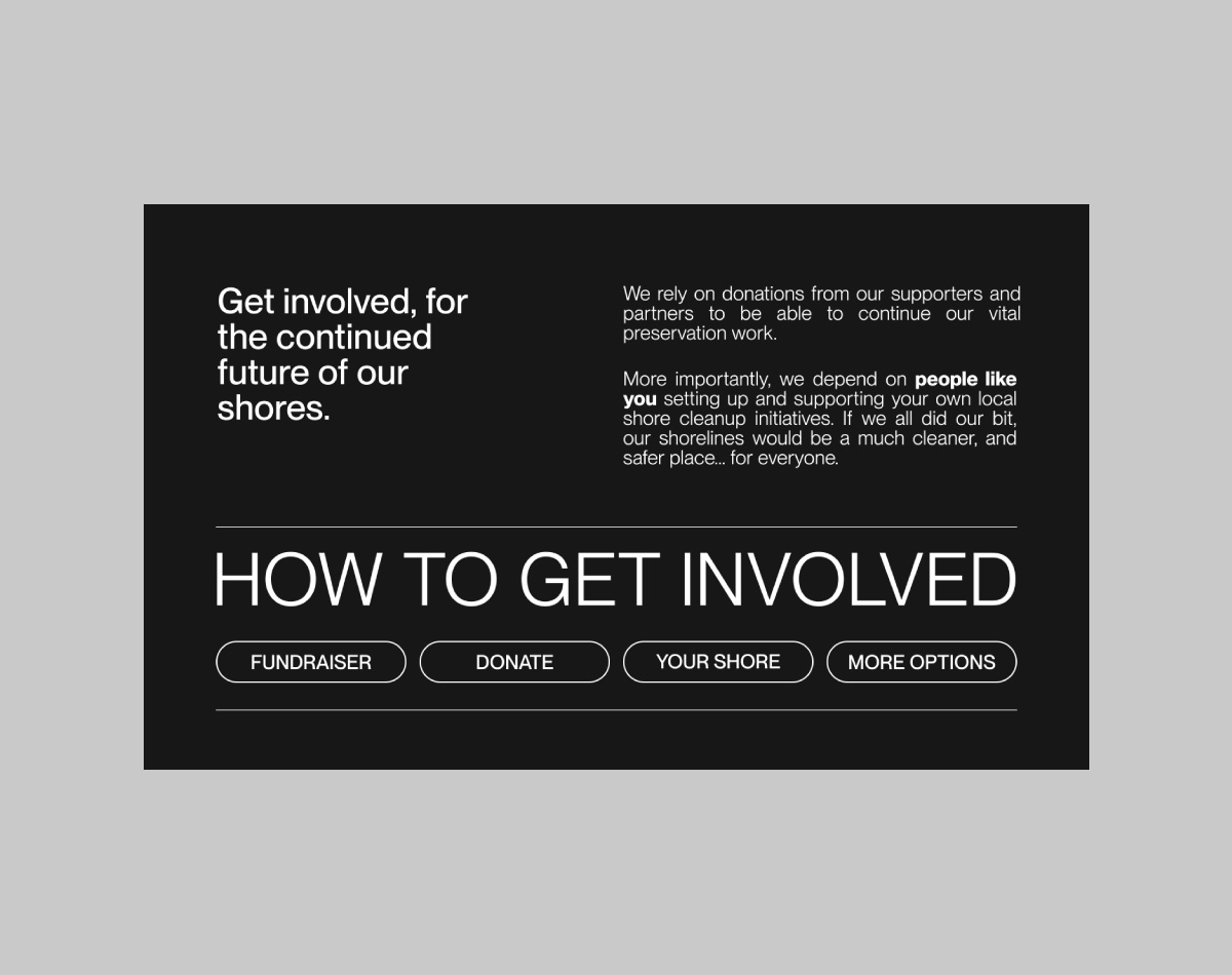