How do you bring a new lease of life to a long-lived genre of music?
SERVICES
Branding, Discography Design, Typography, Art Direction
CLIENT
Danny Horn & The Shared Myths
DATE
May 2020
THE BAND
Looking backwards to look forward. ‘Danny Horn (& The Shared Myths)’ are a contemporary folk band with catchy, rootsy melodies and cutthroat lyrics, musing on the strangeness of life and telling cautionary tales of love and spirituality, peppered with a dry sense of humour. Their debut album, ‘Quitting Smoking’ is a collection of songs exploring millennial existentialism in a fresh way and with a mixture of sincerity and ironic smiles. Although there is a traditional sound to the music, the lyrics are contemporary, interesting, and unlike anything else currently being put out in the music industry.
THE PROBLEM
The brief was to create a visual identity that cuts through the noise of an ever-populated marketplace, that simultaneously reflects a visual representation of the music they’ve made whilst being fresh, quirky, and striking enough to stop people in their tracks. It needed to break the stigma as an ‘outdated’ form of music and appeal to a wider audience. A visual identity was required, as well as discography design and corresponding material for their upcoming debut album.
THE SOLUTION
The band needed to have the accessibility of George Ezra combined with the nostalgia of Bob Dylan. Therefore the solution was to create a visual identity and album artwork that would bring DH&TSM and the wider genre into the modern age… Almost as a reinvention for a new audience. It needed something cheeky and inviting whilst also giving the appearance that it didn’t take itself too seriously.
VISUAL IDENTITY
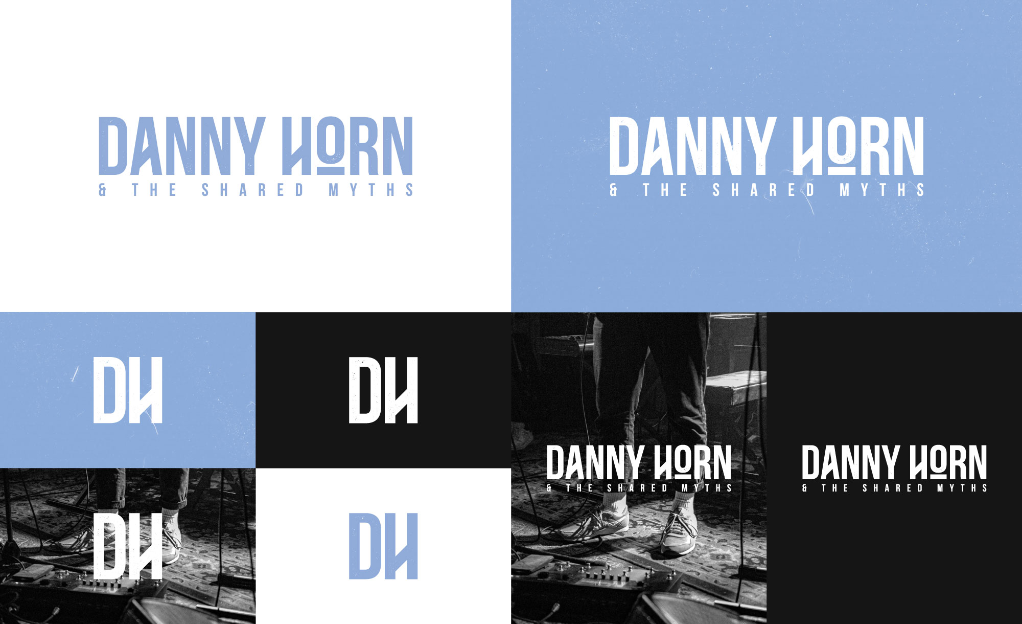
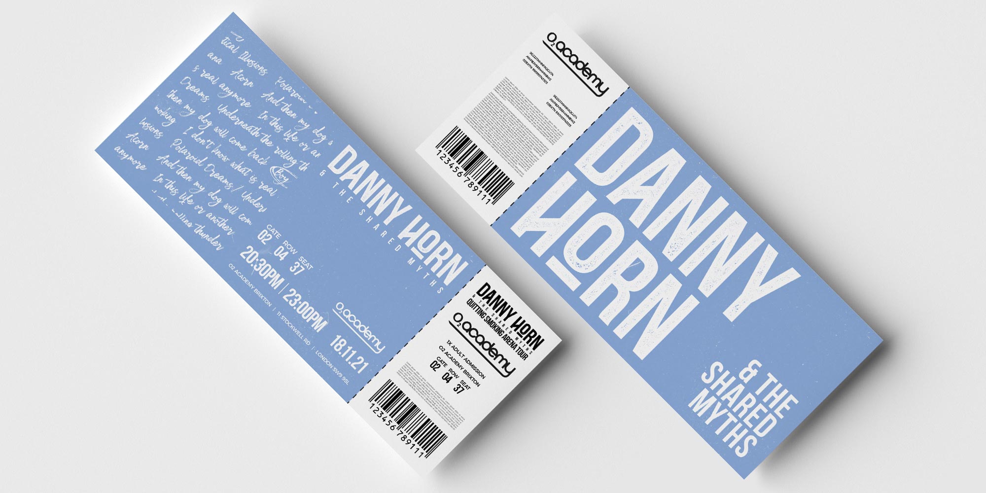
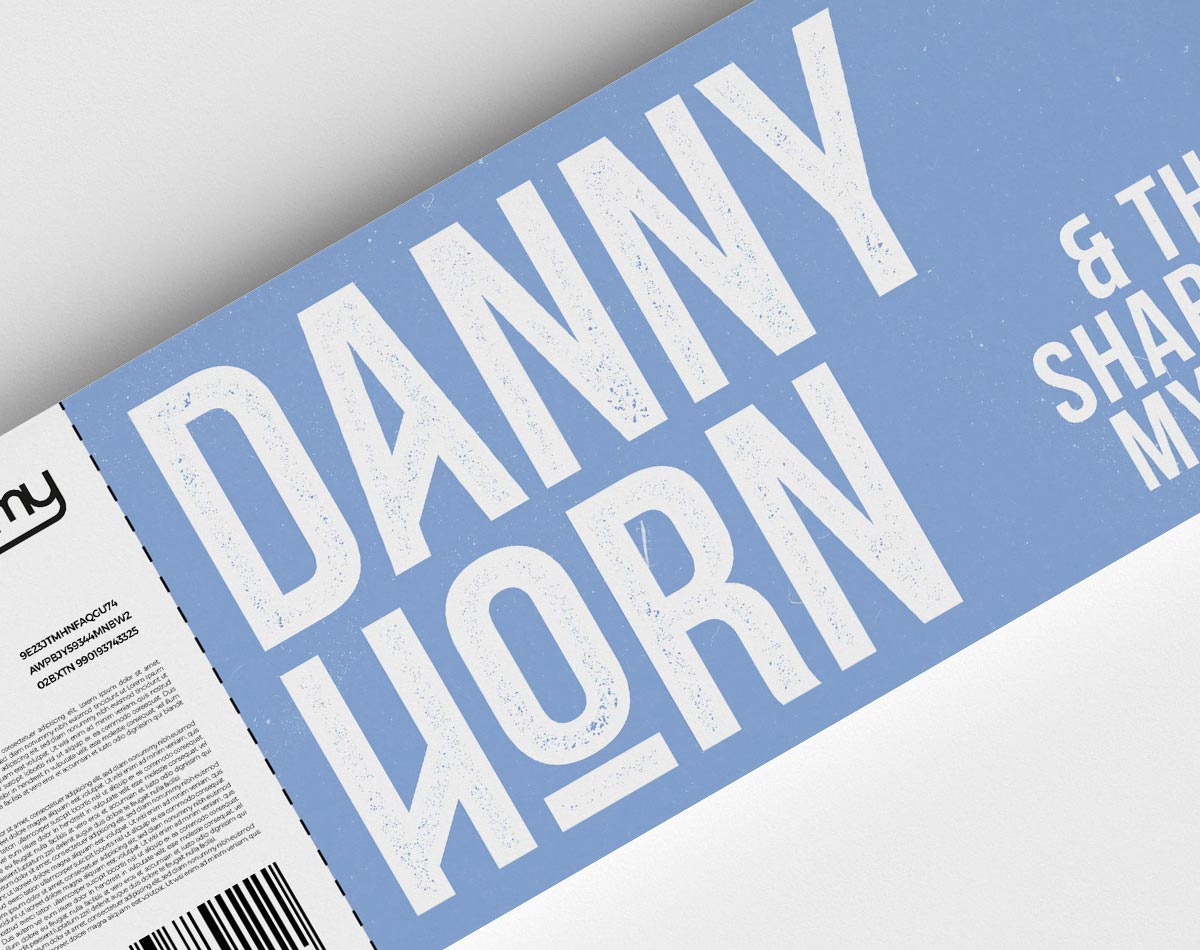
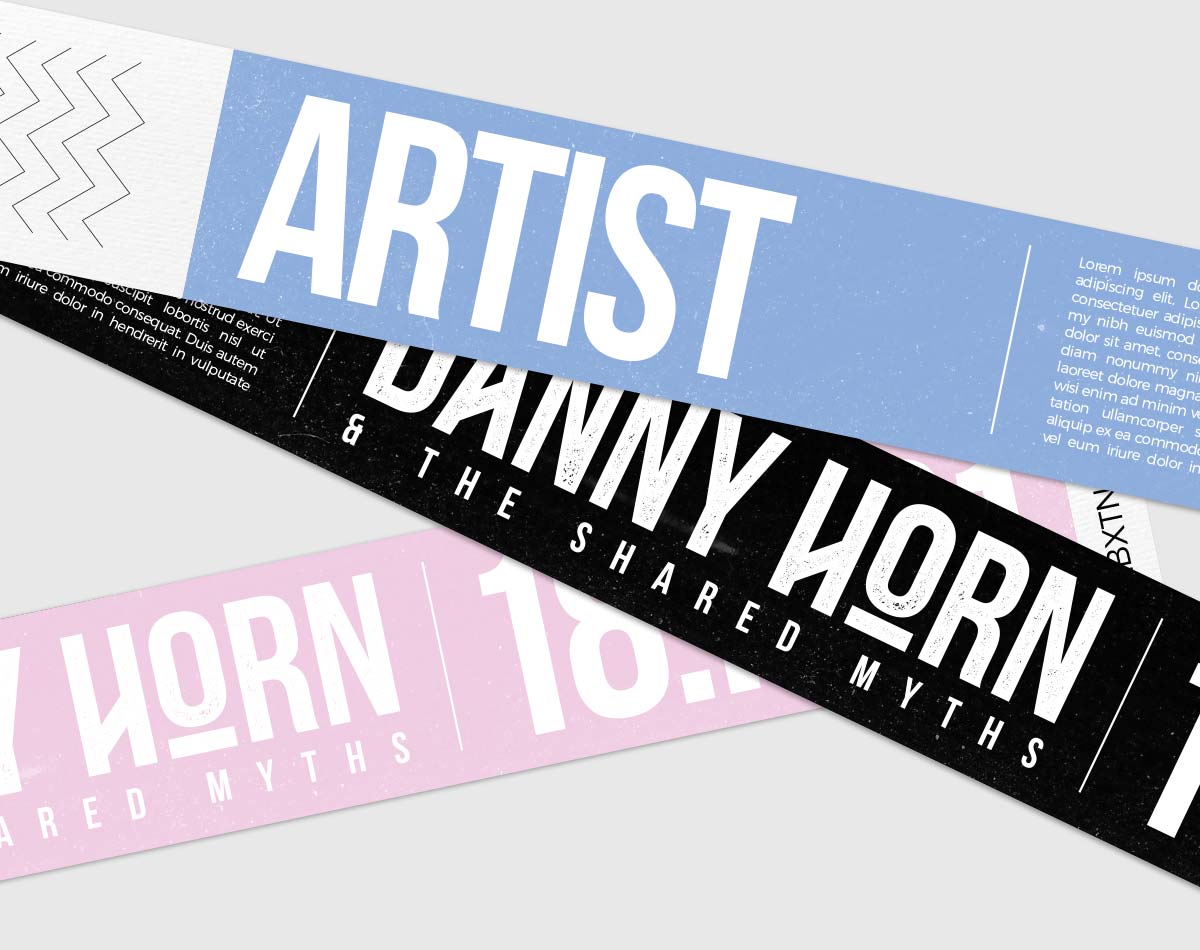
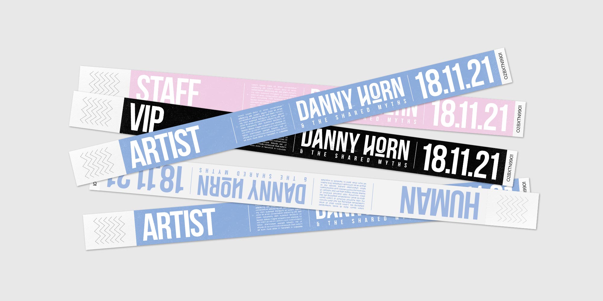
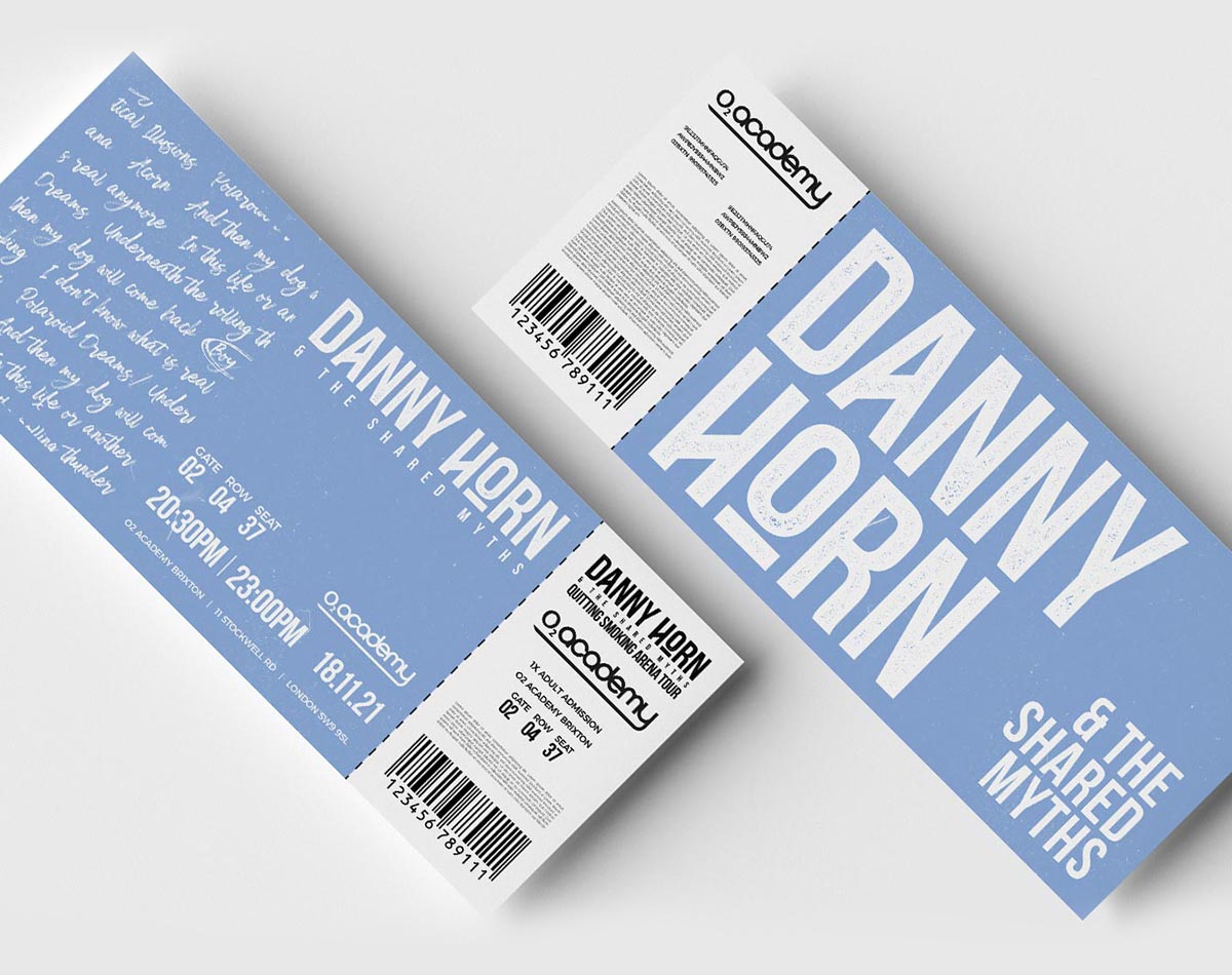
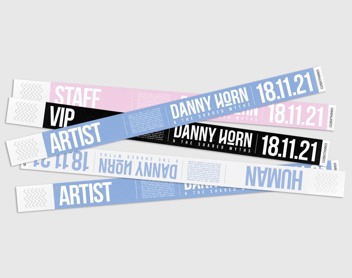
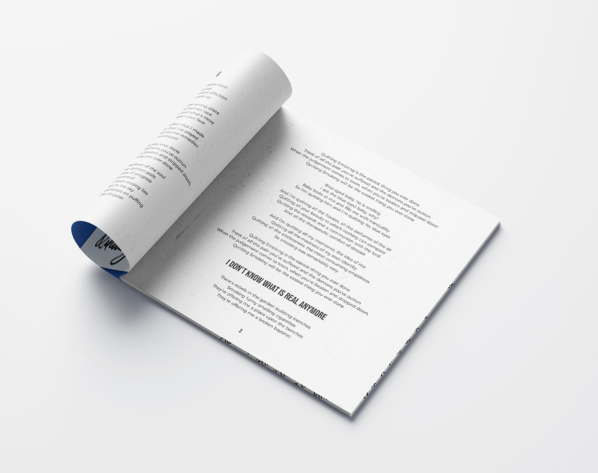
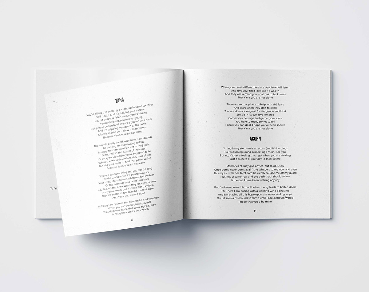
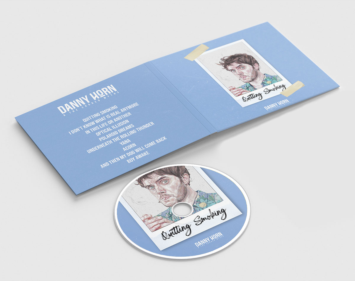
The band’s identity is indicative of the history-rich genre of music, whilst also positioning them as fresh and exciting newcomers to the music scene. It maintains the unconventional appearance of ‘Folk’, alongside being a satirical take on the likes of modern rock and pop. Using a combination of calligraphic and serif type, the identity becomes an embodiment of new and old music merging together. This, alongside the blue, pink, and cream pastel tones, creates an expressive and versatile brand that stands apart from the rest.
ALBUM ARTWORK
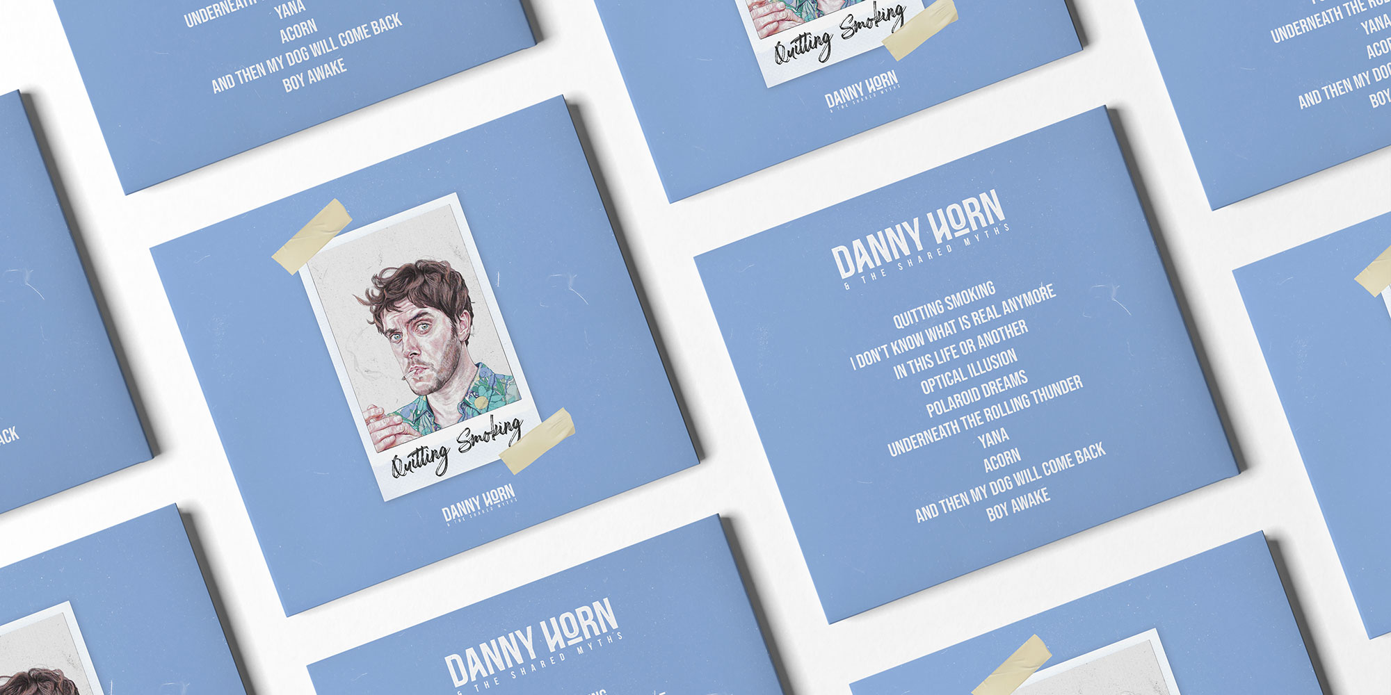
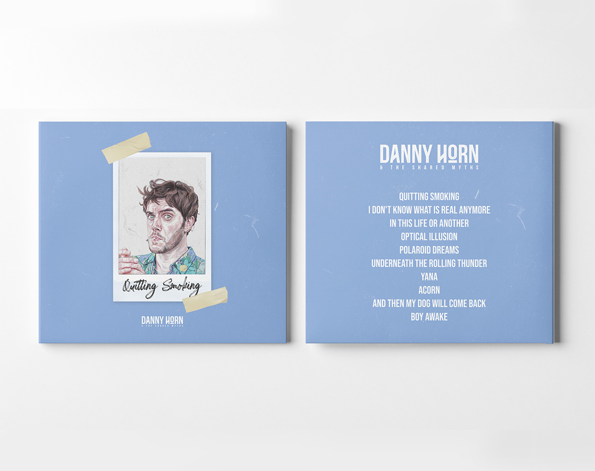
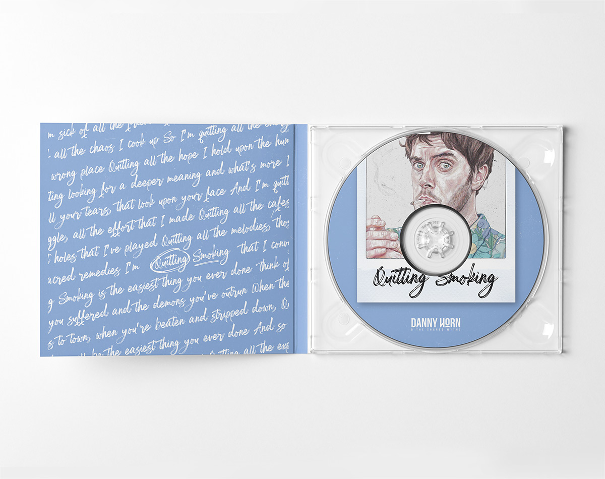
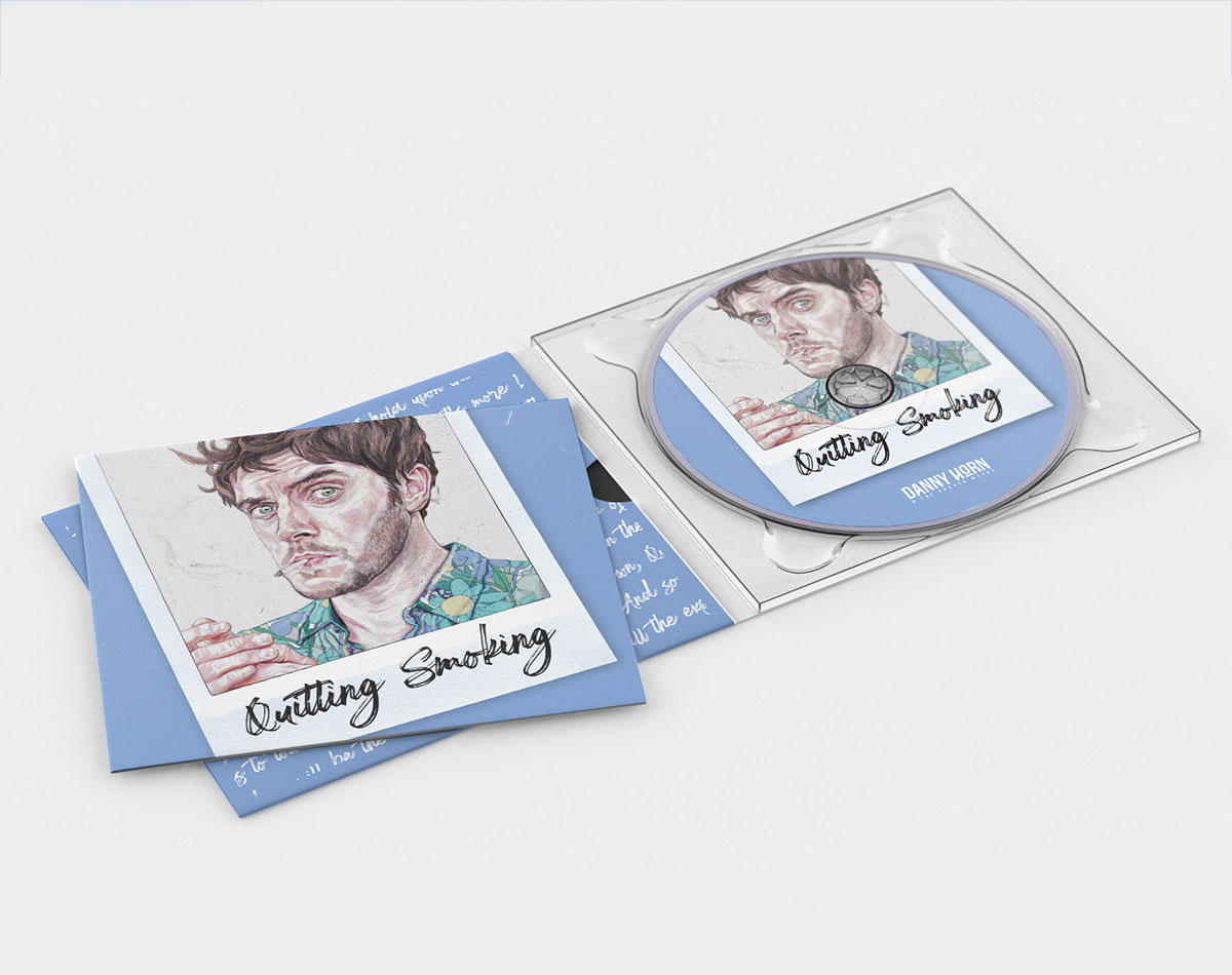
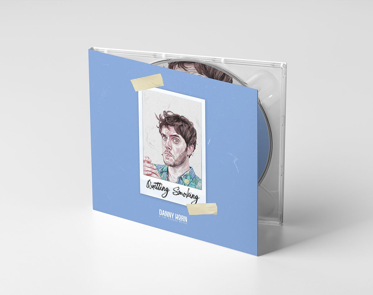
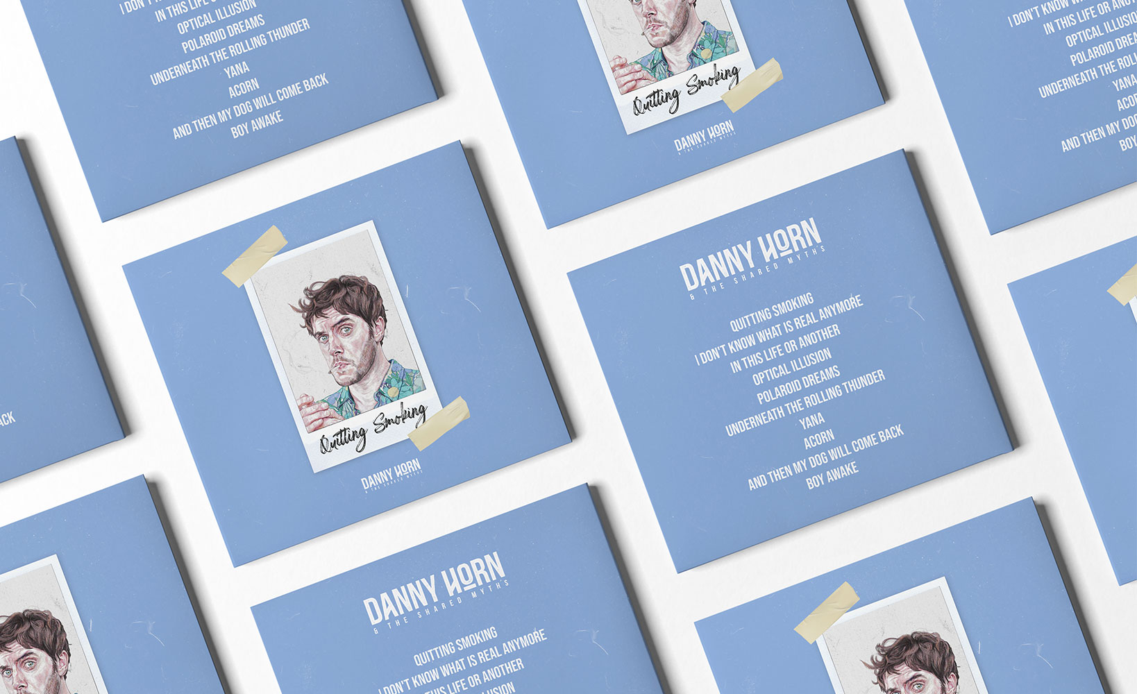
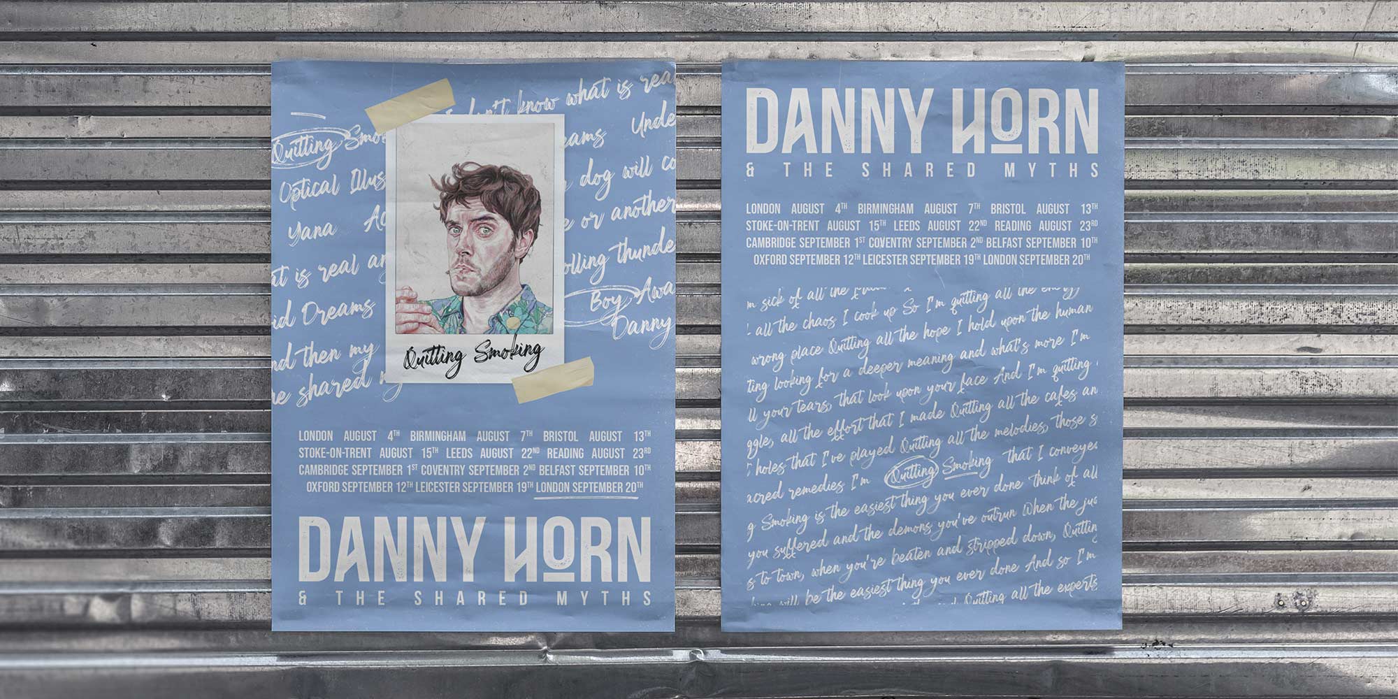
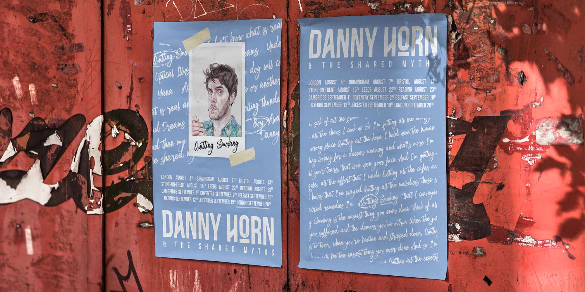
The cover art for the band’s debut album was created in collaboration with illustrator Tal Sharville. The cover itself features an illustration of the band’s lead singer smoking a cigarette, which is then encapsulated within a Polaroid film. This was designed to be representative of some of the headline track names, whilst also being a visual embodiment of the narrative that the album creates.
PROMOTION
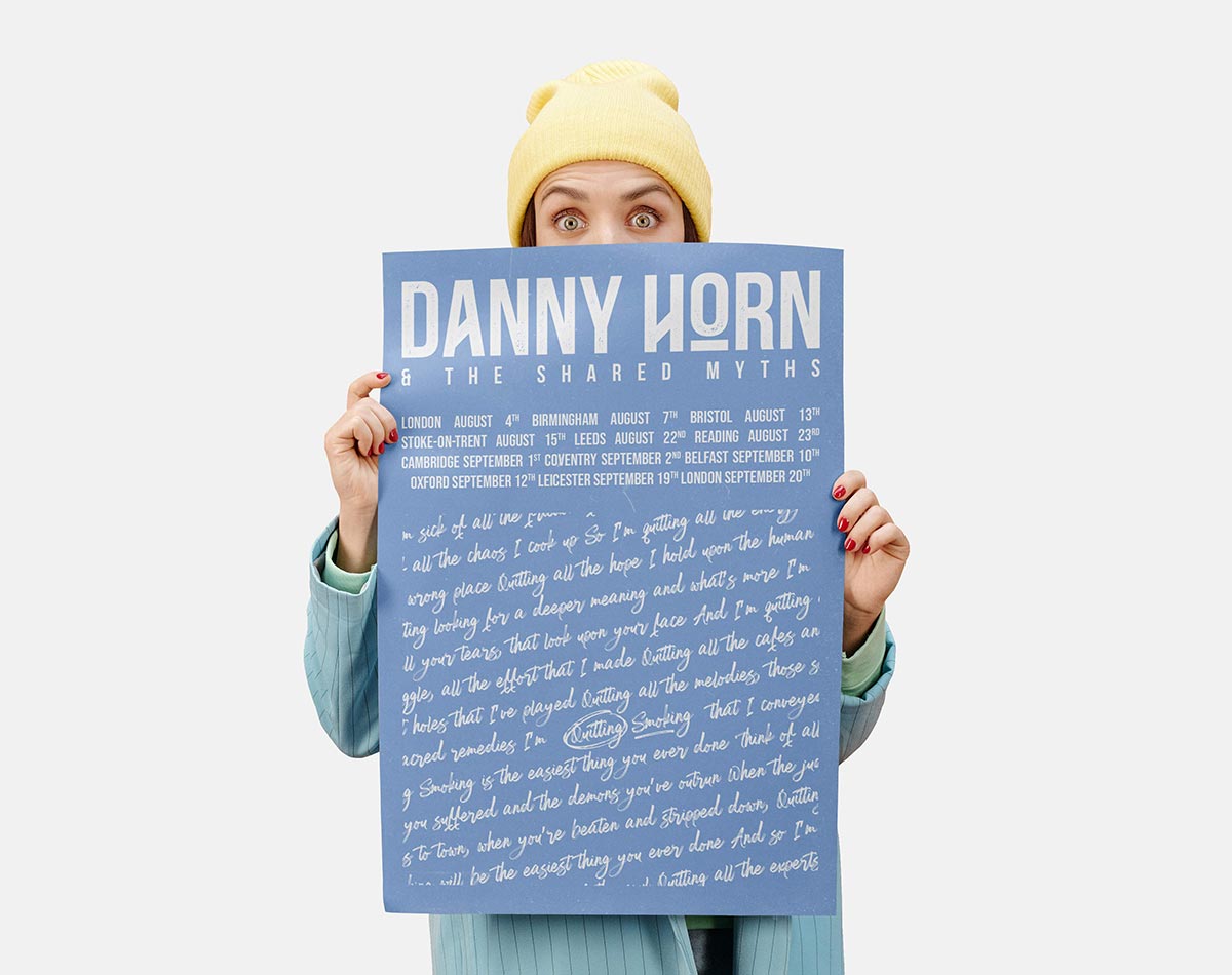
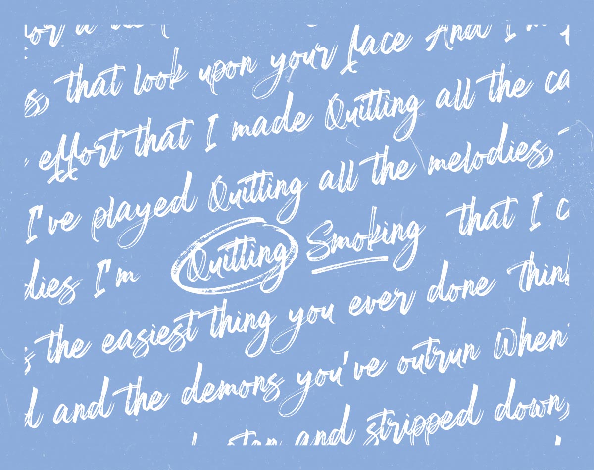
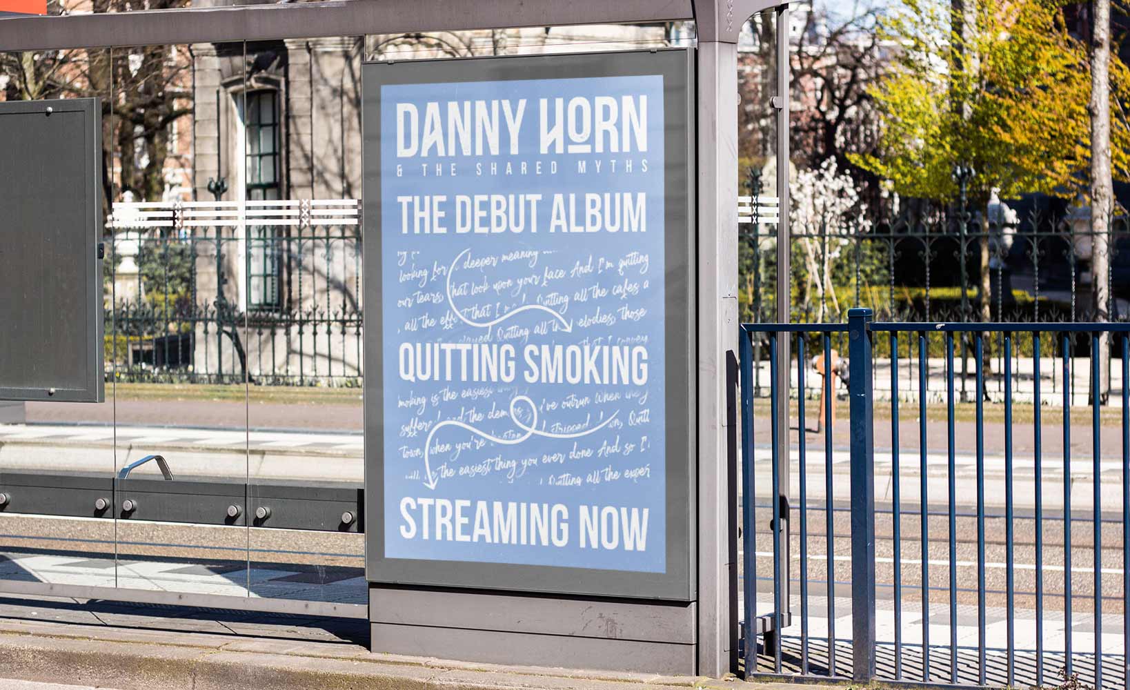
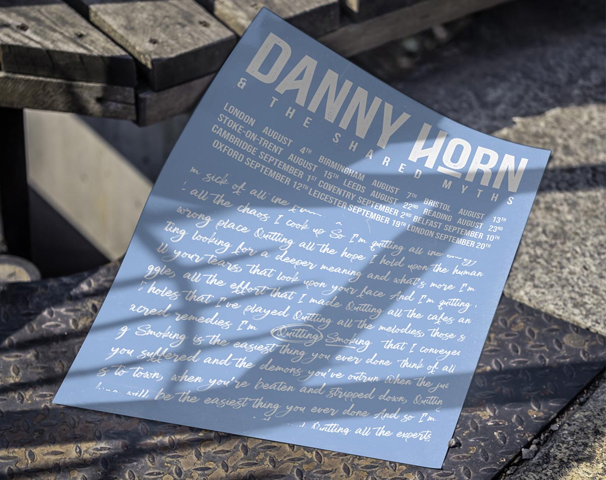
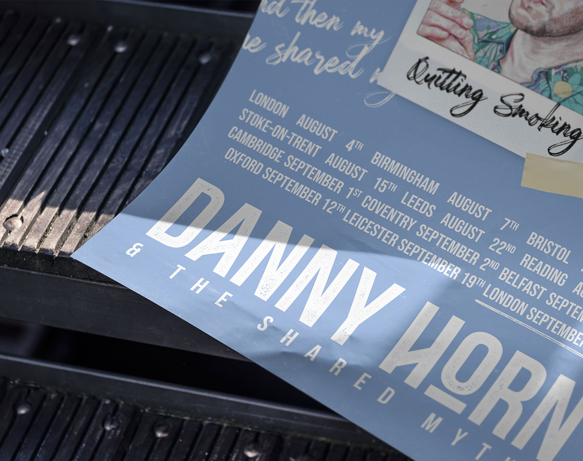
No band is complete without its tour posters. Elements from the album cover were translated across to create a series of posters that promoted both the album, and their up coming tour. The repeated script pattern was carried over from the album collateral and utilised as a backdrop, creating both an eye catching design, and framing the additional content that is featured around it. A simple (yet rigid) grid system is blended with chunky type to create layouts that harken back to tour posters of the late 60s and 70s.
PROMOTIONAL MATERIAL
No band is complete without its tour posters. Elements from the album cover were translated across to create a series of posters that promoted both the album, and their up coming tour. The repeated script pattern was carried over from the album collateral and utilised as a backdrop, creating both an eye catching design, and framing the additional content that is featured around it. A simple (yet rigid) grid system is blended with chunky type to create layouts that harken back to tour posters of the late 60s and 70s.

